A polar bar chart, also known as a radial bar chart, is a type of chart that uses a polar coordinate system to represent data values. The bars in the chart are drawn radially from the center of the chart, with each bar representing a data category. The length of the bar represents the data value, and the angle of the bar represents the category. Polar bar charts are useful for displaying data with cyclical patterns or periodicity.
On the other hand, a stacked polar bar chart is a variation of a polar bar chart that displays data in a stacked format. Each bar is divided into segments or sub-bars, with each segment representing a different sub-category or subset of the data category. The height of each segment represents the data value, and the angle of the bar represents the category. Stacked polar bar charts are useful for displaying data with multiple subcategories or subsets, and for comparing the contributions of different subcategories to the overall data category.
This blog post aims to investigate the relationship between gender and education levels using visual tools such as polar bar charts and stacked polar charts.
Contents
Creating dataset
Set the seed for random number generation and then creates two vectors, “Gender” and “Education”, with the levels “male”/“female” and “Batchelor”/“Master”/“PhD”, respectively. The code then uses the expand.grid() function to create a data frame df with all possible combinations of the levels of the two factors. A response variable is added to the data frame using a normal distribution with mean 25 and standard deviation 4. Finally, the resulting data frame is displayed.
set.seed(123)
# Set the factor levels for the two factors
Gender <- c("male", "female")
Education <- c("Batchelor", "Master", "PhD")

# Create all possible combinations of the two factors using expand.grid
df <- expand.grid(Gender = Gender, Education = Education)

# Add a response variable using a random number generator
df$response <- rnorm(nrow(df), mean = 25, sd = 4)

# View the resulting data frame
df
# Gender Education response # 1 male Batchelor 22.75810 # 2 female Batchelor 24.07929 # 3 male Master 31.23483 # 4 female Master 25.28203 # 5 male PhD 25.51715 # 6 female PhD 31.86026
Polar bar chart
Strengths and weaknesses
Polar bar chart strengths:
- Effective for displaying cyclic data, such as time of day or days of the week.
- Useful for showing changes in composition across categories.
- Can easily be used to compare multiple variables at once.
Polar bar chart weaknesses:
- Can be difficult to read and interpret if there are many categories.
- Can be limited in terms of the amount of data that can be effectively displayed.
- Can be misleading if not constructed properly, especially if the scale is not consistent across categories.
Visualizing polar bar chart
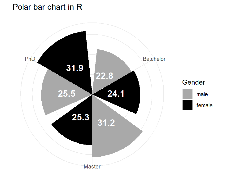
The below code creates a polar chart using the ggplot2 package in R. The data frame df contains two categorical variables, Gender and Education, and a response variable, which is generated using the rnorm function. The code specifies that the Education variable will be plotted on the x-axis and the response variable on the y-axis. The fill variable is set to Gender, so each gender will be represented by a different color. The code then adds bars to the plot using the dodge positioning, which separates the bars for each category. Text labels are added to each bar using the round function to round the response variable to one decimal place. The theme is set to minimal and the coordinate system is set to polar. The fill colors are manually set to dark gray and black, and the y-axis text, ticks, and title are removed from the plot.
library(ggplot2)
# Create a polar bar chart with labels
ggplot(df, aes(x = Education, y = response, fill = Gender)) +   # set the data frame and variables to use
          geom_bar(stat = "identity", position = "dodge") +   # create bars with "dodge" positioning
          geom_text(aes(label = round(response, digits = 1),
                        x = Education, y = response / 2),         # add text labels for each bar
                    position = position_dodge(width = 0.9),
                    size = 5, vjust = -0.5,
                    color = "white", fontface = "bold") +   # adjust text properties (size, color, boldness, etc.)
          labs(fill = "Gender") +   # set the legend title
          theme_minimal() +   # set the theme to minimal
          coord_polar() +   # set the coordinate system to polar
          scale_fill_manual(values = c("darkgray", "black")) +   # manually set the fill colors
          theme(axis.text.y = element_blank(),
                axis.ticks = element_blank(),
                axis.title = element_blank())   # remove the y-axis text, ticks, and title
The chart is a polar bar chart that displays the response variable (generated using a random number generator with mean 25 and standard deviation 4) for each combination of gender and education level. The chart has bars that are divided into segments for each gender, and the bars are positioned radially around a circular axis that represents the different education levels. The chart allows for easy comparison of the response variable for different combinations of gender and education level, and it can be used to identify any patterns or trends in the data.
Stacked polar bar chart
Strengths and weaknesses
Stacked polar chart strengths:
- Allows for easy comparison of both the overall composition of categories and the composition of subcategories within those categories.
- Can help to identify trends and patterns in the data.
- Useful for showing the relationships between different variables.
Stacked polar chart weaknesses:
- Can be difficult to read and interpret if there are many categories or subcategories.
- Can be limited in terms of the amount of data that can be effectively displayed.
- Can be misleading if not constructed properly, especially if the scale is not consistent across categories.
Visualizing stacked polar chart
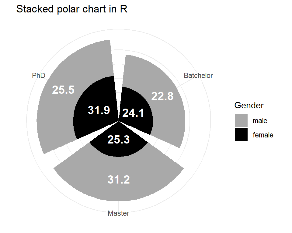
The below code creates a stacked polar chart with labels using the ggplot2 package in R. The data frame df contains variables for Gender, Education, and response. The code defines the aesthetics with ggplot() and uses geom_bar() with the position argument set to “stack” to create stacked bars in the chart. geom_text() is used to add labels to the bars, with position_stack() used to set the position and vertical alignment of the labels. The labs() function is used to set the title and legend title for the chart. theme_minimal() is used to set the theme to a minimal style, and coord_polar() is used to set the coordinates to polar. scale_fill_manual() is used to set the fill colors for the bars, and theme() is used to remove the y-axis labels, ticks, and titles. The resulting chart shows the response variable stacked by gender and education level, with labels indicating the value of the response variable for each group.
# Create a stacked polar chart with labels
ggplot(df, aes(x = Education, y = response, fill = Gender)) +  # Define data and aesthetics
          geom_bar(stat = "identity", position = "stack") +  # Add stacked bars to the plot
          geom_text(aes(label = round(response, digits = 1),  # Add labels to the plot
                        x = Education, y = response,
                        fontface = "bold"),
                    position = position_stack(vjust = 0.5),  # Set position and alignment of labels
                    size = 5, color = "white") +  # Set size and color of labels
          labs(title = "Stacked polar chart in R", fill = "Gender") +  # Add legend title
          theme_minimal() +  # Use a minimal theme
          coord_polar() +  # Use polar coordinates
          scale_fill_manual(values = c("darkgray", "black")) +  # Set fill colors for the bars
          theme(axis.text.y = element_blank(),  # Remove y-axis labels
                axis.ticks = element_blank(),  # Remove y-axis ticks
                axis.title = element_blank())  # Remove axis titles
The stacked polar chart displays the distribution of the response variable for each combination of the two factors (gender and education). The chart is divided into concentric circles, one for each level of education. Within each circle, there are stacked bars that show the distribution of the response variable for males and females within that level of education. The height of each bar represents the sum of the response values for males and females for that level of education. Labels are added to each bar to show the exact value of the response variable for that bar. The chart shows that the response variable tends to be higher for those with higher levels of education and that there is some variation in the response variable between males and females within each level of education.
Download R program — Click_here
Download R studio — Click_here


Its nice
Thank you