A boxplot is a graphical representation of a dataset that displays the distribution of the data through five summary statistics: the minimum and maximum values, the first quartile, the median, and the third quartile. Boxplots are important because they provide a quick and easy way to visually summarize the central tendency, dispersion, and skewness of a dataset. They are particularly useful for comparing multiple datasets side-by-side and identifying outliers or extreme values that may be important to investigate further. Boxplots are widely used in statistical analysis, data visualization, and data exploration, making them a valuable tool for researchers, analysts, and data scientists.
Contents
Creating dataset
The below code generates a simulated dataset to demonstrate the use of ggplot2 package for creating boxplot in R. The set.seed function sets a seed for the random number generator, which ensures that the same set of random numbers will be generated each time the code is run. The dataset consists of three groups, each with 50 observations. The values of these groups are generated using the rnorm function, which generates random numbers from a normal distribution with specified mean and standard deviation. The resulting dataset is then stored in a data frame with two columns, ‘group’ and ‘value’, where ‘group’ is a categorical variable that represents the group each observation belongs to and ‘value’ represents the actual observations.
set.seed(123) # set seed for reproducibility
group1 <- rnorm(50, mean = 10, sd = 2)
group2 <- rnorm(50, mean = 12, sd = 3)
group3 <- rnorm(50, mean = 15, sd = 4)
data <- data.frame(group = factor(rep(c("Group 1", "Group 2", "Group 3"), each = 50)),
                   value = c(group1, group2, group3))
head(data)
# group value # 1 Group 1 8.879049 # 2 Group 1 9.539645 # 3 Group 1 13.117417 # 4 Group 1 10.141017 # 5 Group 1 10.258575 # 6 Group 1 13.430130
Introduction to ggplot2 package
The ggplot2 is a popular data visualization package in R used to create high-quality and customizable graphics. It is built on the principles of the Grammar of Graphics, a conceptual framework for constructing and describing complex visualizations. With ggplot2, users can easily create a wide variety of plots, including scatterplots, line plots, bar plots, histograms, and boxplots, among others. ggplot2 provides a powerful set of tools for customizing the appearance of visualizations, including adjusting colors, fonts, axis labels, and legends. This flexibility, combined with its ease of use, has made ggplot2 a popular choice for data analysts, researchers, and other users in a variety of fields.
Creating a basic boxplot with default settings
The below code uses ggplot2 library to create a basic boxplot in R. It takes a data frame “data” with a column “group” containing the categorical variable for grouping and another column “value” containing the continuous variable to be plotted. The function ggplot() is used to initialize a ggplot object with data and aesthetic mappings. The aes() function is used to specify the x and y variables mapped to the categorical and continuous variables, respectively. Finally, the geom_boxplot() function is used to add the boxplot layer to the ggplot object. This creates a box-and-whisker plot with default settings, where each box represents the interquartile range (IQR) and median of each group’s data distribution, while the whiskers show the range of data.
library(ggplot2)

# Create basic boxplot
ggplot(data, aes(x = group, y = value)) +
  geom_boxplot()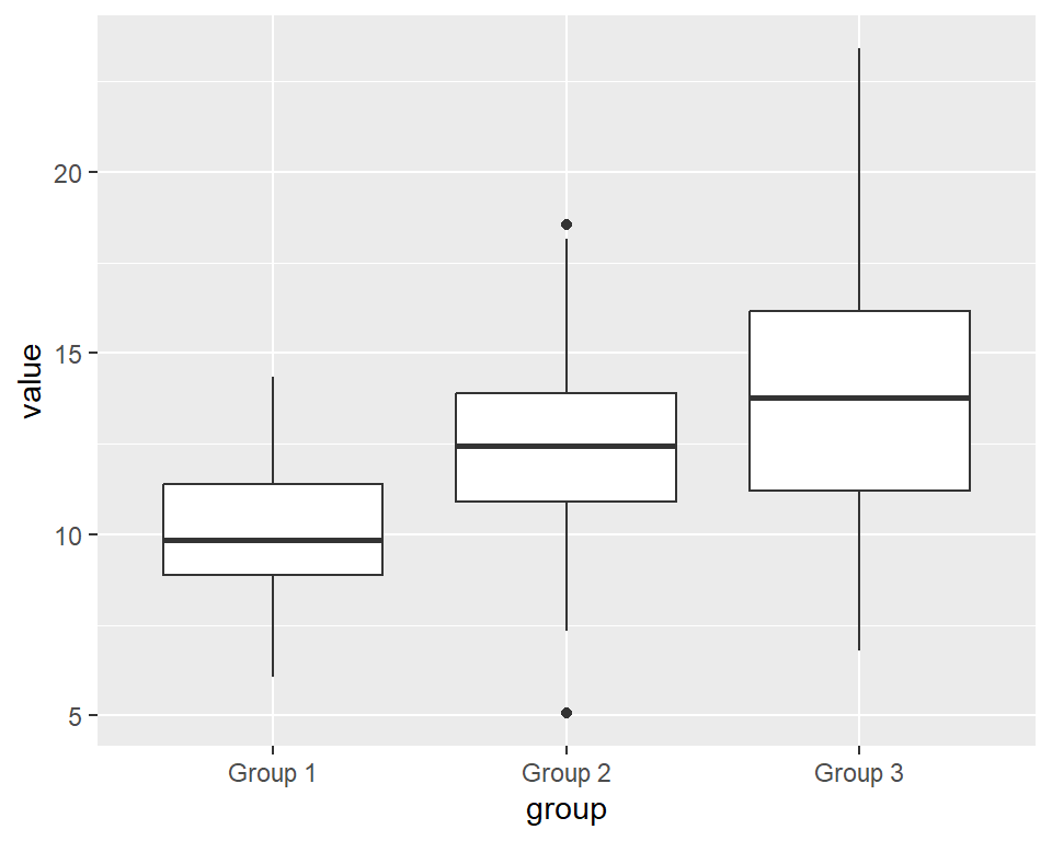
The boxplot shows the distribution of values in three groups (Group 1, Group 2, Group 3) and their respective medians. The central box in each group represents the interquartile range (IQR) of the data, with the lower and upper whiskers representing the lowest and highest observations within 1.5 times the IQR from the box, respectively. Any values outside of the whiskers are plotted as points, which are commonly referred to as “outliers”. From the plot, we can see that Group 1 has a lower median and a narrower distribution compared to the other two groups, which have similar medians but wider distributions.
Customizing the appearance of a boxplot
Changing color, width, and style of the boxplot
The ggplot() function is used to create the plot object, and aes() is used to define the aesthetic mappings for the plot. The x aesthetic is set to the group column of the data dataframe, and the y aesthetic is set to the value column. The geom_boxplot() function is used to add a boxplot layer to the plot, with the fill argument set to “orange”, color argument set to “blue”, size argument set to 1, and linetype argument set to “solid”. These arguments are used to customize the appearance of the boxplot by changing the fill color, border color, size, and line type of the boxes.
ggplot(data, aes(x = group, y = value)) +
  geom_boxplot(fill = "orange",
               color = "blue",
               size = 1,
linetype = "solid") 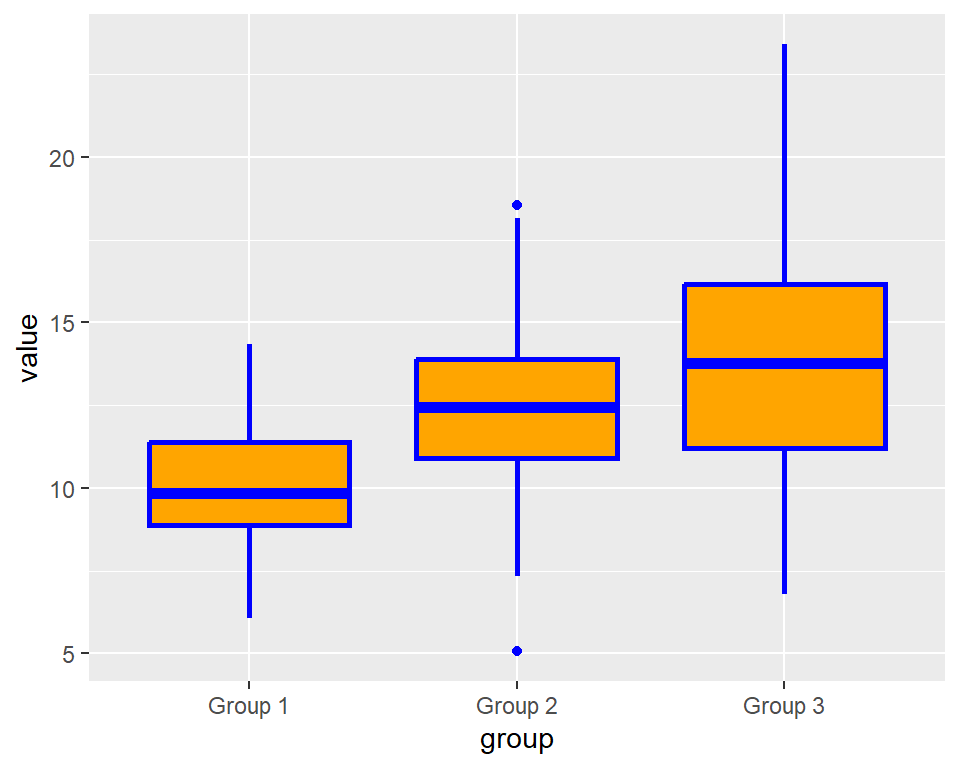
We can use the scale_fill_manual() function to manually set the fill color for the different groups in a boxplot. In this example, the values argument is used to assign a unique color to each group in the data (Group 1, Group 2, and Group 3). The colors are specified using hexadecimal color codes, which are six-digit codes that represent different colors in the RGB (red-green-blue) color model. The resulting plot will have a custom color scheme based on the specified colors.
ggplot(data, aes(x = group, y = value, fill = group)) +
          geom_boxplot(color = "blue",
                       size = 1,
                       linetype = "solid") +
          scale_fill_manual(values = c("Group 1" = "#1b9e77", "Group 2" = "#d95f02", "Group 3" = "#7570b3"))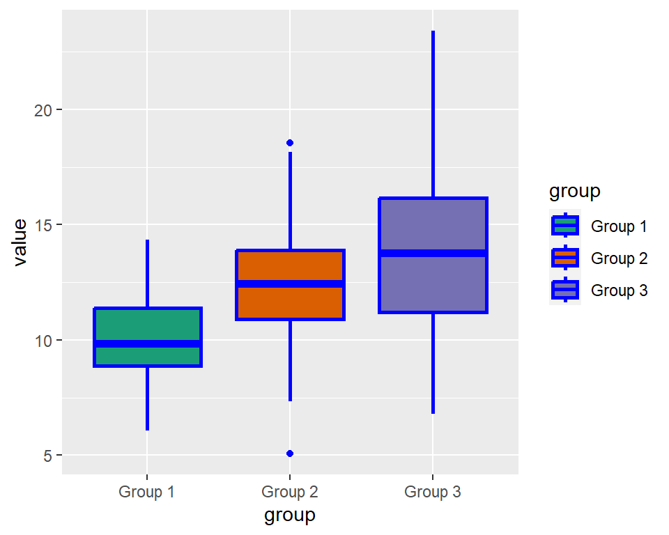
Adding title and labels to a boxplot
The labs() function is used to set the labels of the x and y axis and the title of the plot. In this example, the title is set to “Customized Boxplot”, the x-axis label is set to “Group”, and the y-axis label is set to “Value”. This helps to make the plot more informative and easier to understand.
ggplot(data, aes(x = group, y = value, fill = group)) +
          geom_boxplot(color = "blue",
                       size = 1,
                       linetype = "solid") +
          scale_fill_manual(values = c("Group 1" = "#1b9e77",
                                       "Group 2" = "#d95f02",
                                       "Group 3" = "#7570b3")) +
  labs(title = "Customized Boxplot", x = "Group", y = "Value")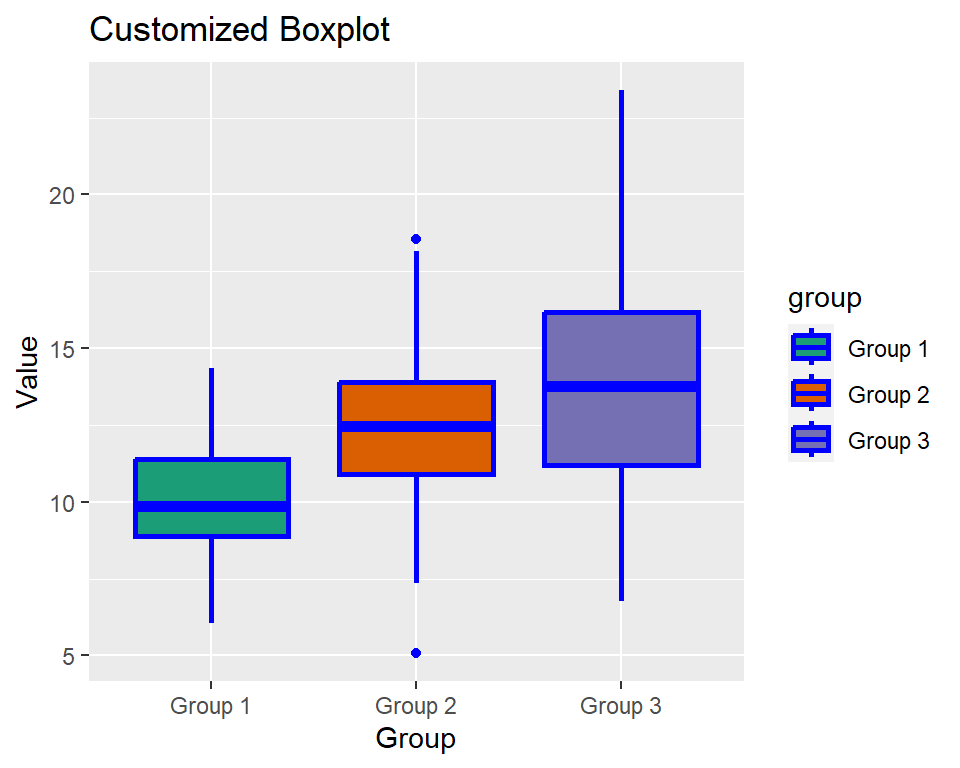
Changing theme
The function theme_bw() from the ggplot2 package sets the theme of the plot to a black and white theme. It provides a simple, clean, and uncluttered background for the plot, allowing the data to be the main focus. This theme is particularly useful when creating plots for publication or presentation, where clarity and simplicity are important. It is one of the many pre-built themes available in the ggplot2 package that can be easily applied to any plot.
ggplot(data, aes(x = group, y = value, fill = group)) +
          geom_boxplot(color = "blue",
                       size = 1,
                       linetype = "solid") +
          scale_fill_manual(values = c("Group 1" = "#1b9e77",
                                       "Group 2" = "#d95f02",
                                       "Group 3" = "#7570b3")) +
  labs(title = "Customized Boxplot", x = "Group", y = "Value") +
          theme_bw()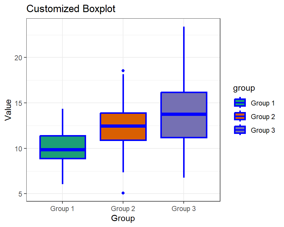
Discussion of potential use cases for boxplots
Boxplots are a useful tool for visualizing and summarizing the distribution of a dataset. Some potential use cases for boxplots include:
- Comparing groups: Boxplots can be used to compare the distribution of a variable across different groups. For example, a researcher might use a boxplot to compare the distribution of test scores between different schools or the distribution of income between different regions.
- Identifying outliers: Boxplots can help identify outliers, or extreme values, in a dataset. Outliers can be important to investigate further, as they may indicate errors in the data or unusual observations.
- Assessing variability: Boxplots provide a visual representation of the variability of a dataset. The size of the box and the length of the whiskers can provide an indication of how spread out the data is.
- Checking assumptions: Boxplots can be used to check assumptions of statistical tests, such as the assumption of equal variances in ANOVA. If the boxplots for different groups have noticeably different shapes or sizes, this may indicate that the assumption of equal variances is not met.
- Exploratory data analysis: Boxplots are a useful exploratory data analysis tool for getting a quick overview of the distribution of a variable. They can provide insights into the central tendency, variability, and skewness of a dataset, as well as any potential outliers.
Conclusion
I hope that the explanations provided were helpful in understanding the different aspects of customizing boxplots in ggplot2. With the knowledge gained, you can create customized boxplots that are visually appealing and convey important insights from your data. Remember, ggplot2 is a powerful visualization tool that can be used to create a wide range of visualizations, so don’t be afraid to experiment and explore its full capabilities.
Download R program — Click_here
Download R studio — Click_here

