Correlation analysis is a statistical technique used to examine the relationship between two or more variables. In R, this analysis can be performed using various built-in functions and packages. Investigating relationships between variables with correlation analysis in R can help to identify patterns, dependencies, and potential causal relationships between variables. It is a powerful tool for understanding the underlying structure of data and can be used in a wide range of applications, from social sciences to finance and engineering.
In this example, we will use a dataset that we have generated to demonstrate how to investigate relationships between variables with correlation analysis in R. The dataset has five variables, namely, x1, x2, x3, x4, and x5, and they are all correlated in different ways. By generating this correlated data, we can evaluate the correlation coefficients between the variables to determine the degree and nature of the relationship between them. We will use the summary statistics and correlation matrix to visualize and summarize the relationships between the variables, and draw inferences about their potential impact on one another. By the end of this exercise, we should have a better understanding of how to generate and analyze correlated data in R.
Contents
- 1 Generating Correlated Data
- 2 Exploring Data
- 3 Computing pairwise correlations between variables
- 4 Interpreting Correlation Coefficients
- 5 Creating a Heatmap for Correlation Matrix
- 6 Displaying Lower Triangle of Correlation Matrix
- 7 Display Correlation Coefficients in the Heatmap
- 8 Examine the relationships between pairs of variables
- 9 Analyzing Relationships with Causality
- 10 Repeat the analysis
- 11 Conclusion
The command “set.seed(123)” is used to ensure the reproducibility of results in random sampling or generation of data. In this case, the command is followed by R code that generates correlated data, which includes five variables, namely x1, x2, x3, x4, and x5. The code generates 100 random values for each variable with different levels of correlation among them. Finally, the generated data is combined into a data frame using the “data.frame” function in R, and the first few rows of the data frame are displayed using the “head” function.
set.seed(123) # for reproducibility

# Generate correlated data
x1 <- rnorm(100)
x2 <- x1 + rnorm(100, mean = 0, sd = 0.5)
x3 <- 2*x1 + x2 + rnorm(100, mean = 0, sd = 0.2)
x4 <- rnorm(100, mean = 1, sd = 0.5)
x5 <- 0.5*x2 + 0.2*x4 + rnorm(100, mean = 0, sd = 0.3)

# Combine the data into a dataframe
data <- data.frame(x1 = x1, x2 = x2, x3 = x3, x4 = x4, x5 = x5)

head(data)
# x1 x2 x3 x4 x5 # 1 -0.56047565 -0.9156789 -1.5968682 0.6423789 -0.35143049 # 2 -0.23017749 -0.1017356 -0.2996080 0.6236555 -0.27673214 # 3 1.55870831 1.4353624 4.4997500 0.5307306 0.63340284 # 4 0.07050839 -0.1032629 0.1463927 0.4737434 0.03446475 # 5 0.12928774 -0.3465215 -0.1708141 0.7814202 0.18423206 # 6 1.71506499 1.6925511 5.0274317 1.1655896 0.58422952
Exploring Data
Summary Statistics: Analyzing Range and Distribution
The code summary(data) calculates and displays summary statistics for each variable in the dataset data. The summary statistics include the minimum and maximum values, the first and third quartiles, and the median and mean values. This information is useful for getting a quick overview of the distribution and range of values for each variable.
summary(data) # summary statistics for each variable# x1 x2 x3 x4 # Min. :-2.30917 Min. :-2.28697 Min. :-6.7024 Min. :-0.2329 # 1st Qu.:-0.49385 1st Qu.:-0.62197 1st Qu.:-1.4581 1st Qu.: 0.6353 # Median : 0.06176 Median : 0.10307 Median : 0.1502 Median : 0.9982 # Mean : 0.09041 Mean : 0.03663 Mean : 0.2415 Mean : 0.9819 # 3rd Qu.: 0.69182 3rd Qu.: 0.67648 3rd Qu.: 2.0199 3rd Qu.: 1.3443 # Max. : 2.18733 Max. : 2.48769 Max. : 7.2357 Max. : 2.2857 # x5 # Min. :-1.18781 # 1st Qu.:-0.06258 # Median : 0.25796 # Mean : 0.24645 # 3rd Qu.: 0.60721 # Max. : 1.60868
From the results, we can see that the range of values for each variable is different, with some variables having larger values than others. For example, variable x3 has the largest range of values, with a minimum of -6.7024 and a maximum of 7.2357, while variable x5 has the smallest range of values, with a minimum of -1.18781 and a maximum of 1.60868.
We can also see that the mean value for x3 is the largest among all the variables, indicating that on average, x3 has higher values compared to the other variables. The median value for x4 is 0.9982, which is very close to its maximum value of 2.2857, suggesting that this variable has a relatively large spread of values.
Exploring Data Structure
The str() function in R is used to display the structure of an object, including its type, length, and content. In this case, the function is applied to the data object, which is a data frame that contains the generated correlated data.
str(data) # structure of the data# 'data.frame': 100 obs. of 5 variables: # $ x1: num -0.5605 -0.2302 1.5587 0.0705 0.1293 ... # $ x2: num -0.916 -0.102 1.435 -0.103 -0.347 ... # $ x3: num -1.597 -0.3 4.5 0.146 -0.171 ... # $ x4: num 0.642 0.624 0.531 0.474 0.781 ... # $ x5: num -0.3514 -0.2767 0.6334 0.0345 0.1842 ...
The str function has provided information about the structure of the data frame. From the output, we can see that the data frame has 100 observations(rows) and 5 variables(columns) named x1, x2, x3, x4, and x5. Each variable is represented as a numeric data type with decimal points, and the decimal values are shown for the first few observations.
Computing pairwise correlations between variables
To better understand the relationship between these variables, we wanted to compute pairwise correlations between them. So, we used a magical function called “cor” in R, which took our data set as input and calculated the correlation coefficients between each pair of variables. The result of this calculation was a matrix of correlation coefficients, which we stored in a variable called “cor_matrix”. We could then use this matrix to explore the relationships between variables and see which pairs were strongly or weakly correlated.
# compute pairwise correlations between all variables
cor_matrix <- cor(data)
cor_matrix
# x1 x2 x3 x4 x5 # x1 1.0000000 0.87869927 0.98164518 -0.04407900 0.7224050 # x2 0.8786993 1.00000000 0.94749740 -0.01882534 0.8187413 # x3 0.9816452 0.94749740 1.00000000 -0.03942647 0.7752018 # x4 -0.0440790 -0.01882534 -0.03942647 1.00000000 0.1673405 # x5 0.7224050 0.81874131 0.77520176 0.16734045 1.0000000
Interpreting Correlation Coefficients
Looking at the correlation matrix, we see that x1 has a very strong positive correlation with x2 and x3 (0.88 and 0.98, respectively), indicating that as x1 increases, so do x2 and x3. Conversely, x4 has a weak negative correlation with x1 (-0.04), suggesting that there is little relationship between these two variables. Finally, x5 has a moderate positive correlation with x2 and x3 (0.82 and 0.78, respectively), indicating that as x2 and x3 increase, so does x5.
These correlation coefficients suggest that there are strong relationships between x1, x2, and x3, as well as a moderate relationship between x2, x3, and x5. On the other hand, there appears to be little to no relationship between x1 and x4.
Creating a Heatmap for Correlation Matrix
We can use a heatmap to display the correlation matrix using ggplot2 and reshape2 packages. The “subset” function is used to remove the diagonal values from the correlation matrix, as they are always equal to 1 and are not useful in the context of the heatmap. The “ggplot” function is then used to create the heatmap with the “geom_tile” function, which creates the individual tiles of the heatmap. The “scale_fill_gradient2” function is used to specify the color scheme for the heatmap. The color scheme used ranges from blue for negative correlations to red for positive correlations, with white for no correlation. The “theme_minimal” function is used to create a simple background for the heatmap, and the “axis.text.x” function is used to angle the x-axis labels to make them easier to read. Finally, the “labs” function is used to add a title and remove the x and y axis labels, which are not necessary in this case. The resulting heatmap is a useful visualization tool for identifying the relationships between variables in a dataset.
library(ggplot2)
library(reshape2)

ggplot(melt(cor_matrix), aes(x = Var1, y = Var2, fill = value)) +
  geom_tile(color = "white") +
  scale_fill_gradient2(low = "blue", mid = "white", high = "red", midpoint = 0) +
  theme_minimal() +
  theme(axis.text.x = element_text(angle = 45, vjust = 1, hjust = 1)) +
          labs(title = "Heatmap for Correlation Matrix", x = "", y = "")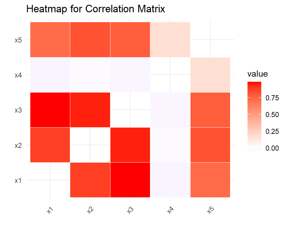
The colors in the heat map represent the strength and direction of the correlations between each pair of variables. From the heat map, we can see that x1 has a strong positive correlation with x2 and x3 (dark red color), indicating that as x1 increases, so do x2 and x3. Similarly, x2 and x3 also have a strong positive correlation with each other (also dark red color). In contrast, x1 has a weak negative correlation with x4 (light blue color), indicating that there is little relationship between these two variables.
The heatmap also shows that x5 has a moderate positive correlation with x2 and x3 (medium red color), indicating that as x2 and x3 increase, so does x5. Finally, x5 has a weak positive correlation with x4 (light red color), suggesting that there is a small relationship between these two variables.
Displaying Lower Triangle of Correlation Matrix
The below code differs from the first one in that it only displays the lower triangle of the correlation matrix, whereas the first code displays the entire matrix including the upper diagonal. This is achieved by using the lower.tri() function within the subset() command to filter only the lower triangle of the matrix. The Var1 != Var2 condition in the first code is used to remove the diagonal elements which are not needed for the correlation matrix plot.
ggplot(subset(melt(cor_matrix), lower.tri(cor_matrix)),
       aes(x = Var1, y = Var2, fill = value)) +
  geom_tile(color = "white") +
  scale_fill_gradient2(low = "blue", mid = "white", high = "red", midpoint = 0) +
  theme_minimal() +
  theme(axis.text.x = element_text(angle = 45, vjust = 1, hjust = 1)) +
  labs(title = "Heatmap for Correlation Matrix", x = "", y = "")
Display Correlation Coefficients in the Heatmap
You can display correlation coefficients in the below heatmap by using the geom_text() function. This will add the correlation coefficients as text labels on each tile in the heatmap. The round() function is used to round the values to two decimal places, and the color and size arguments are used to specify the text color and size.
ggplot(subset(melt(cor_matrix), lower.tri(cor_matrix)),
       aes(x = Var1, y = Var2, fill = value)) +
  geom_tile(color = "white") +
  scale_fill_gradient2(low = "blue", mid = "white", high = "red", midpoint = 0) +
  theme_minimal() +
  theme(axis.text.x = element_text(angle = 45, vjust = 1, hjust = 1)) +
  labs(title = "Heatmap for Correlation Matrix", x = "", y = "") +
          geom_text(aes(label = round(value, 2)), color = "black", size = 3)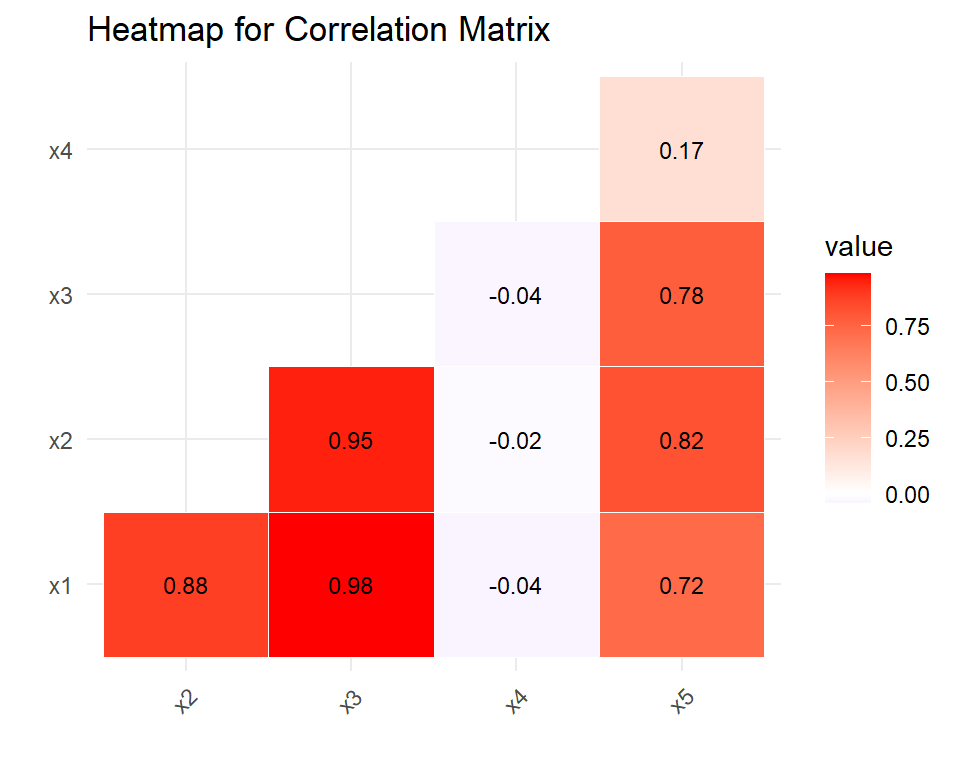
Examine the relationships between pairs of variables
The pairs() function in R is used to create a matrix of scatterplots to visualize the relationships between variables in a data frame. In this case, the function is applied to the data data frame, which contains the generated correlated data. The upper.panel argument is set to NULL to remove the upper triangular panels in the plot, which are redundant since the plots in the lower triangular panels are mirror images.
pairs(data, upper.panel = NULL)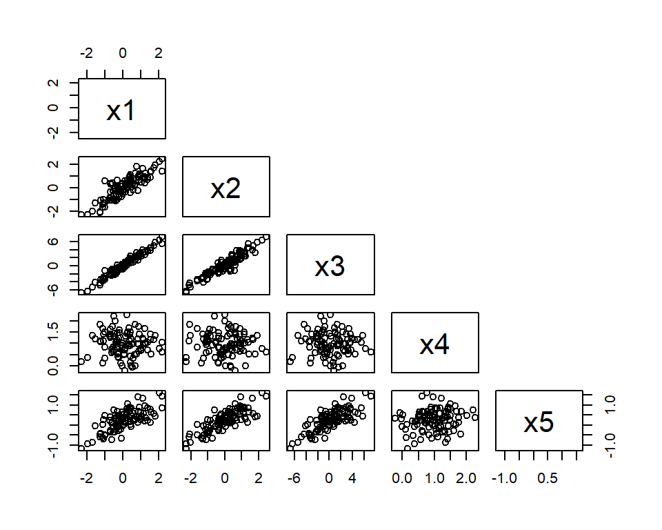
Looking at the scatterplots, we can see that x1 has a linear relationship with x2 and x3, as evidenced by the clustering of points along a diagonal line. This suggests a positive correlation between these variables. The scatterplots of x1 and x4, and x5 and x4, show no clear relationship between these pairs of variables. The scatterplots of x2 and x5, and x3 and x5, show a positive linear relationship, again indicating a positive correlation between these variables.
Analyzing Relationships with Causality
When analyzing relationships between variables, it is important to consider causality. Correlation analysis can help identify associations between variables, but it does not necessarily imply causation. In other words, just because two variables are correlated does not mean that changes in one variable cause changes in the other. To establish causality, further investigation is needed, such as controlled experiments or longitudinal studies. It is also important to consider other factors that may be influencing the relationship between the variables.
Repeat the analysis
Repeating analysis based on causality requires carefully examining the data and conducting additional tests to determine the direction and strength of the causal relationship. This may involve adjusting the analysis methods or including additional variables to control for confounding factors that could influence the results. By carefully considering causality in the data analysis process, we can gain a better understanding of the underlying relationships between variables and make more informed decisions based on the results.
Conclusion
This report has demonstrated the use of correlation analysis in R to investigate relationships between variables. Through the generation of correlated data, exploration of summary statistics and data structure, computation of pairwise correlations, and examination of relationships between pairs of variables, we were able to identify strong and moderate correlations between certain variables, as well as little to no relationship between others. However, it is important to note that correlation does not necessarily imply causation, and further investigation is needed to establish causality. Repeat analysis based on causality requires careful examination of the data and conducting additional tests to determine the direction and strength of the causal relationship. By carefully considering causality in the data analysis process, we can gain a better understanding of the underlying relationships between variables and make more informed decisions based on the results.
Download R program — Click_here
Download R studio — Click_here

