Contents
Introduction:
In this tutorial, we will explore how to create a PCA biplot using the popular R libraries ggplot2 and ggrepel. Principal Component Analysis (PCA) is a powerful statistical technique used for dimensionality reduction and visualizing patterns in high-dimensional data. By the end of this guide, you will be able to load the iris dataset, perform PCA, extract scores and loadings, and generate an interactive biplot with customizable labels and axes.
During the implementation, we encountered a notable challenge related to utilizing distinct secondary labels for the vector loading on the X and Y axes. Modifying the scale had unintended consequences on the primary X and Y axis scales, resulting in points exceeding beyond the plot margin. To address this issue and maintain separate scales for the secondary labels, we devised a feasible solution involving the multiplication of xend and yend by a factor of 3.
Follow along with the steps outlined below to gain a comprehensive understanding of creating and customizing a PCA biplot. By the end of this tutorial, you will have the skills to visualize and interpret complex data patterns effectively. Let’s get started!
Loading the Required Libraries
To begin, we need to load the necessary R libraries. We will be using ggplot2, devtools, and ggrepel. These libraries provide powerful tools for data visualization and labeling.
library(ggplot2)
library(devtools)
library(ggrepel)
Loading the Iris Dataset
The iris dataset is a popular dataset in the field of data analysis and machine learning. It contains measurements of iris flowers from three different species. We will load the iris dataset into our R environment.
# Load iris dataset
data(iris)
Running PCA and Extracting Scores and Loadings
Next, we will perform PCA on the iris dataset and extract the scores and loadings. This will allow us to plot the data points and the directions of the principal components in our biplot.
# Run PCA and extract scores and loadings
iris_pca <- prcomp(iris[-5], scale. = TRUE)

# Getting proportion of variance explained by PC1 and PC2
prop_var <- iris_pca$sdev^2 / sum(iris_pca$sdev^2)

scores <- as.data.frame(iris_pca$x)
scores$Species <- iris$Species

loadings <- as.data.frame(iris_pca$rotation)
loadings$Species <- rownames(loadings)
Creating the Biplot
Now, we will use ggplot2 to create the biplot. The biplot combines a scatter plot of the data points with arrows indicating the directions and magnitudes of the loadings. This provides a visual representation of the relationships between the variables and the observations.
# Create biplot
biplot <- ggplot(data = scores, aes(x = PC1, y = PC2)) +
          geom_point(aes(color = Species), size = 2, shape = 19) +
          geom_segment(
                    data = loadings, aes(
                              x = 0, y = 0,
                              xend = PC1 , yend = PC2
                    ),
                    arrow = arrow(length = unit(0.3, "cm"), type = "open", angle = 25),
                    size = 1, color = "darkblue"
          )
biplot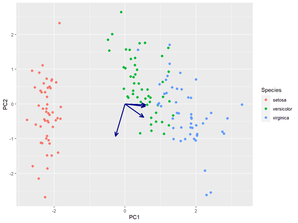
Creating different secondary scale for vector loadings
One of the notable challenges encountered was the utilization of distinct secondary labels for the vector loading on the X and Y axes. Modifying the scale had unintended consequences on the primary X and Y axis scales, leading to points extending beyond the plot margin. In order to address this issue and maintain separate scales for the secondary labels, a feasible solution involved the multiplication of xend and yend by a factor of 3.
scale <- 3
# Create biplot
biplot <- ggplot(data = scores, aes(x = PC1, y = PC2)) +
          geom_point(aes(color = Species), size = 2, shape = 19) +
          geom_segment(
                    data = loadings, aes(
                              x = 0, y = 0,
                              xend = PC1 * 3, yend = PC2 * 3
                    ),
                    arrow = arrow(length = unit(0.3, "cm"), type = "open", angle = 25),
                    size = 1, color = "darkblue"
          )
biplot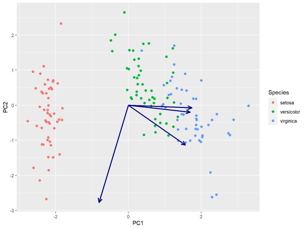
Customizing the Biplot
In this step, we will customize the biplot to enhance its readability and aesthetics. We will adjust the scales of the axes, add labels to the data points, and modify the appearance of the plot.
biplot +
          # Primary and secondary scales
          scale_x_continuous(
                    limits = c(-3, 3), name = paste0("PC1 (",round(prop_var[1]*100, digits = 2), " %)"),
                    sec.axis = sec_axis(~ . / scale, name = "Loadings on PC1")
          ) +
          scale_y_continuous(
                    limits = c(-3, 3), name = paste0("PC2 (",round(prop_var[2]*100, digits = 2), " %)"),
                    sec.axis = sec_axis(~ . / scale, name = "Loadings on PC2")
          ) +
          geom_label_repel(
                    data = loadings,
                    aes(
                              label = rownames(loadings),
                              x = PC1 * scale,
                              y = PC2 * scale
                    ),
                    box.padding = 0.2,
                    point.padding = 0.3,
                    size = 3, # Change the font size of the text here
                    color = "black", # Change the color of the text here
                    arrow = arrow(length = unit(0.3, "cm"), type = "closed", angle = 25),
                    force = 4
          ) +
          # Theme with modified axis text color
          theme_bw() +
          theme(
                    axis.title.x.top = element_text(color = "darkblue"),
                    axis.title.y.right = element_text(color = "darkblue"),
                    axis.text.x.top = element_text(color = "darkblue"),
                    axis.ticks.x.top = element_line(color = "darkblue"),
                    axis.text.y.right = element_text(color = "darkblue"),
                    axis.ticks.y.right = element_line(color = "darkblue"), legend.position = "top"
          ) +
          labs(title = "Biplot - PCA")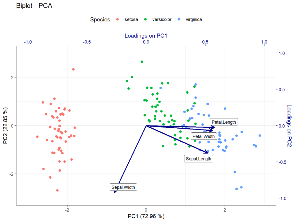
Conclusion:
In this tutorial, we have learned how to create a PCA biplot using ggplot2 and ggrepel libraries in R. By following these steps, you can effectively visualize and analyze patterns in your data using principal component analysis. Experiment with different datasets and explore the insights provided by biplots. Happy analyzing!
Download R program — Click_here
Download R studio — Click_here

