Contents
Introduction
Welcome to our blog post on creating an elegant fuel efficiency bar plot, perfect for research article publications. In this step-by-step guide, we’ll walk you through the process of crafting a visually appealing and informative bar plot using R. Let’s dive in!
Package Installation
To get started, we’ll install the necessary R packages. No need to worry; it’s a simple process. Just execute the following command.
# Installing packages
install.packages(c('tidyverse','devtools','gghalves', 'agricolae'))
devtools::install_github('smin95/smplot2', force = TRUE)
Package Loading
Now that we’ve installed the required packages, let’s load the libraries needed for our analysis. These packages will enable us to create our elegant fuel efficiency bar plot.
# Loading packages
library(ggplot2)
library(smplot2)
library(agricolae)
Analysis of Variance (ANOVA)
Our dataset contains valuable information on various car models and their performance characteristics. To investigate the relationship between fuel efficiency and the number of cylinders, we’ll perform an Analysis of Variance (ANOVA).
# Analysis of variance (ANOVA) ----
data("mtcars")
model <- aov(mpg ~ cyl, data = mtcars)
anova(model)
# Analysis of Variance Table # # Response: mpg # Df Sum Sq Mean Sq F value Pr(>F) # cyl 1 817.71 817.71 79.561 6.113e-10 *** # Residuals 30 308.33 10.28 # --- # Signif. codes: 0 '***' 0.001 '**' 0.01 '*' 0.05 '.' 0.1 ' ' 1
Performing LSD Test
To compare the means of fuel efficiency across different cylinder groups, we’ll conduct a Least Significant Difference (LSD) test. This will help us identify significant differences between the groups.
# Perform the Least Significant Difference (LSD) test
test <- LSD.test(y = model,
                 trt = "cyl",
                 DFerror = model$df.residual,
                 MSerror = deviance(model)/model$df.residual,
                 group = TRUE,
                 console = TRUE)
# # Study: model ~ "cyl" # # LSD t Test for mpg # # Mean Square Error: 10.27781 # # cyl, means and individual ( 95 %) CI # # mpg std r se LCL UCL Min Max Q25 Q50 Q75 # 4 26.66364 4.509828 11 0.9666158 24.68954 28.63773 21.4 33.9 22.80 26.0 30.40 # 6 19.74286 1.453567 7 1.2117171 17.26820 22.21751 17.8 21.4 18.65 19.7 21.00 # 8 15.10000 2.560048 14 0.8568134 13.35015 16.84985 10.4 19.2 14.40 15.2 16.25 # # Alpha: 0.05 ; DF Error: 30 # Critical Value of t: 2.042272 # # Groups according to probability of means differences and alpha level( 0.05 ) # # Treatments with the same letter are not significantly different. # # mpg groups # 4 26.66364 a # 6 19.74286 b # 8 15.10000 c
Preparing Group Component from LSD
With the LSD test results at hand, we’ll extract the ‘groups’ component and create a ‘group’ data frame. This will be essential for the final step of our plot.
# Extract the 'groups' component from the 'test' object
group <- test$groups
# Extract the row names (levels) from the 'groups' component
levels <- rownames(test$groups)
# Add a new column 'cyl' to the 'group' data frame
group$cyl <- levels
group
# mpg groups cyl # 4 26.66364 a 4 # 6 19.74286 b 6 # 8 15.10000 c 8
Creating the Elegant Fuel Efficiency Bar Plot
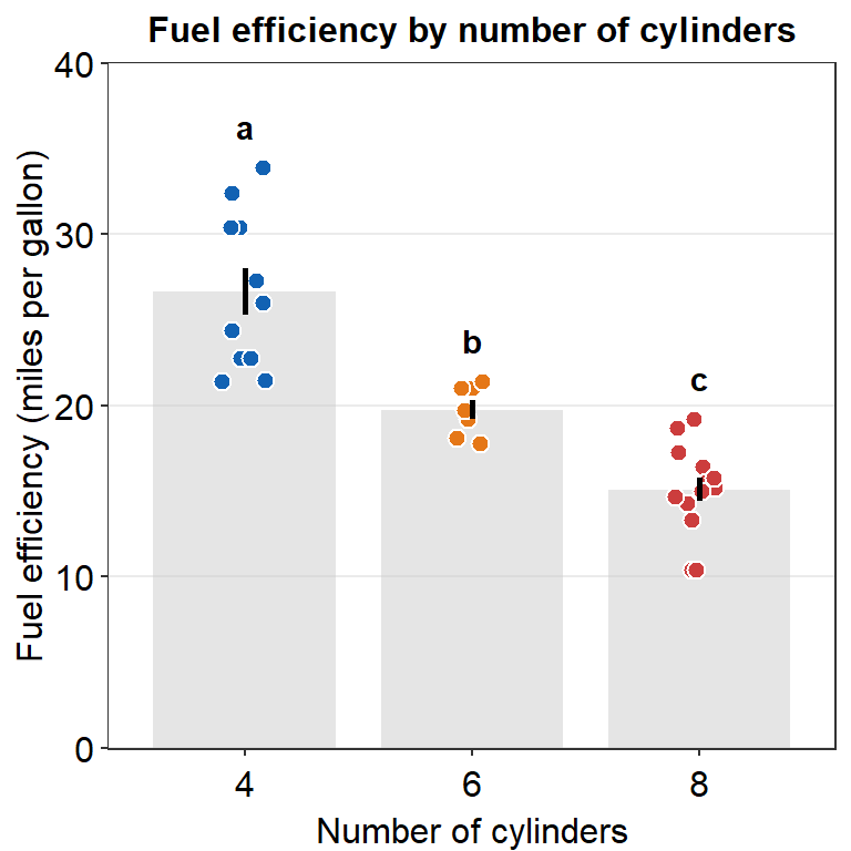
Finally, it’s time to unveil our masterpiece: the elegant fuel efficiency bar plot. This striking visualization will help showcase the impact of cylinders on fuel efficiency.
# Step 1: Set up the base plot with data and aesthetic mappings
ggplot(data = mtcars, mapping = aes(x = factor(cyl), y = mpg, fill = factor(cyl))) +
  # Step 2: Add a half-width bar plot using 'sm_bar' with customized parameters
  sm_bar(bar.params = list(fill = 'gray80', width = 0.8, alpha = 0.5),
         point.params = list(size = 2.5, shape = 21, color ='white',
                             stroke = 0.75)) +
  # Step 3: Set plot labels and title
  labs(title = "Fuel efficiency by number of cylinders",
       x = "Number of cylinders",
       y = "Fuel efficiency (miles per gallon)") +
  # Step 4: Customize the y-axis limits and expansion
  scale_y_continuous(limits = c(0,40), expand = c(0,0.05)) +
  # Step 5: Set manual fill colors for the bars
  scale_fill_manual(values = sm_color('blue', 'orange', 'red')) +
  # Step 6: Add text labels using 'geom_text' with customized parameters
  geom_text(data = group, aes(x = cyl,
                y = aggregate(mpg ~ cyl, data = mtcars, max)[[2]] + 1,
                label = groups), fontface = "bold",
            position = position_dodge(width = 0.9),
            vjust = -(0.5))
Conclusion
Congratulations! You’ve just created an elegant fuel efficiency bar plot, perfect for research article publications. This stunning visualization showcases the relationship between fuel efficiency and cylinder counts, presenting your findings with style and clarity. Thank you for joining us today, and we hope this tutorial has been both informative and inspiring. Happy plotting!.
Download R program —
Click_hereDownload R studio —
Click_here


