A barplot is a type of graph that displays data using rectangular bars, where the height or length of each bar represents the value of the corresponding variable or category. Barplots are commonly used to visualize categorical or discrete data, such as frequencies, counts, or percentages of different categories or groups.
In a typical barplot, the x-axis represents the categories or groups being compared, and the y-axis represents the values or counts associated with each category. The bars can be arranged horizontally or vertically, depending on the orientation of the plot.
Barplots are useful for comparing the relative sizes or proportions of different categories, identifying trends or patterns in the data, and highlighting differences or similarities between groups. They are also easy to interpret and communicate, making them a popular choice for presenting data in a variety of fields, such as business, finance, marketing, social sciences, and public health.
In this example we shall create a barplot and we shall add standard error as well as lettering on top of each bar using ggplot() function from ggplot2 package in R.
Contents
Creating dataset
We shall use the example from our previous blog post on split plot analysis in R. If you want to know the complete description of the dataset as well as analysis then you should visit this post first before proceeding further. Here we shall not discuss details on the analysis and interpretation of the results. We shall only focus on how to create barplot using ggplot function in R.
# Creating data
library(dplyr)
set.seed(123)

Control <- rnorm(n = 6, mean = 15, sd = 3.4)
T25kg <- rnorm(n = 6, mean = 22, sd = 5.5)
T50kg <- rnorm(n = 6, mean = 45, sd = 9.5)
T75kg <- rnorm(n = 6, mean = 35, sd = 8.2)

yield <- as.data.frame(cbind(Control, T25kg, T50kg, T75kg))
yield$Method <- rep(c("Broadcasting", "Fertigation"), each = 3)
yield$Rep <- rep(c(1:3), times = 2)

df <- yield %>% tidyr::pivot_longer(!c(Rep, Method),
                                    names_to = "Dose",
                                    values_to = "yield")
df <- as.data.frame(df)
df
# Method Rep Dose yield # 1 Broadcasting 1 Control 13.09438 # 2 Broadcasting 1 T25kg 24.53504 # 3 Broadcasting 1 T50kg 48.80733 # 4 Broadcasting 1 T75kg 40.75112 # 5 Broadcasting 2 Control 14.21740 # 6 Broadcasting 2 T25kg 15.04216 # 7 Broadcasting 2 T50kg 46.05149 # 8 Broadcasting 2 T75kg 31.12311 # 9 Broadcasting 3 Control 20.29961 # 10 Broadcasting 3 T25kg 18.22231 # 11 Broadcasting 3 T50kg 39.71951 # 12 Broadcasting 3 T75kg 26.24385 # 13 Fertigation 1 Control 15.23973 # 14 Fertigation 1 T25kg 19.54886 # 15 Fertigation 1 T50kg 61.97567 # 16 Fertigation 1 T75kg 33.21261 # 17 Fertigation 2 Control 15.43958 # 18 Fertigation 2 T25kg 28.73245 # 19 Fertigation 2 T50kg 49.72958 # 20 Fertigation 2 T75kg 26.58676 # 21 Fertigation 3 Control 20.83122 # 22 Fertigation 3 T25kg 23.97898 # 23 Fertigation 3 T50kg 26.31714 # 24 Fertigation 3 T75kg 29.02309
Data wrangling and fitting model
Changing variable structure from character to factor variables.
# converting variables to factors
df$Rep <- as.factor(df$Rep)
df$Method <- as.factor(df$Method)
df$Dose <- as.factor(df$Dose)
str(df)
# 'data.frame': 24 obs. of 4 variables: # $ Method: Factor w/ 2 levels "Broadcasting",..: 1 1 1 1 1 1 1 1 1 1 ... # $ Rep : Factor w/ 3 levels "1","2","3": 1 1 1 1 2 2 2 2 3 3 ... # $ Dose : Factor w/ 4 levels "Control","T25kg",..: 1 2 3 4 1 2 3 4 1 2 ... # $ yield : num 13.1 24.5 48.8 40.8 14.2 ...
Masking the components of the dataset using attach() function.
# Masking components of the data
attach(df)
Fitting analysis of variance model for split plot design.
# Fitting ANOVA model for split plot design
model <- aov(yield ~ Rep + Method * Dose + Error(Rep/Method),
              data = df)
summary(model)
# # Error: Rep # Df Sum Sq Mean Sq # Rep 2 173.8 86.89 # # Error: Rep:Method # Df Sum Sq Mean Sq F value Pr(>F) # Method 1 6.519 6.519 0.607 0.518 # Residuals 2 21.492 10.746 # # Error: Within # Df Sum Sq Mean Sq F value Pr(>F) # Dose 3 2902.3 967.4 14.975 0.000233 *** # Method:Dose 3 47.2 15.7 0.244 0.864145 # Residuals 12 775.2 64.6 # --- # Signif. codes: 0 '***' 0.001 '**' 0.01 '*' 0.05 '.' 0.1 ' ' 1
Least Significant Difference test
Getting error degree of freedom and error mean square from the ANOVA model.
# Getting Edf and EMS from aov() model
# Error df for main plot factor (Method)
Edfa <- model$`Rep:Method`$df.residual
Edfa
# Error df for subplot factor (Dose)
Edfb <- model$Within$df.residual
Edfb
# Error MS for main plot factor (Method)
EMSa <- summary(model$`Rep:Method`)[[1]][[3]][2]
EMSa
# Error MS for subplot factor (Dose)
EMSb <- summary(model$Within)[[1]][[3]][3]
EMSb
# [1] 2 # [1] 12 # [1] 10.74608 # [1] 64.60155
Applying LSD test and getting the output.
library(agricolae)
LSD <- with(df,
            LSD.test(
                      y = yield,
                      trt = Dose,
                      DFerror = Edfb,
                      MSerror = EMSb,
                      alpha = 0.05,
                      group = TRUE,
                      console = TRUE
            )

)
# # Study: yield ~ Dose # # LSD t Test for yield # # Mean Square Error: 64.60155 # # Dose, means and individual ( 95 %) CI # # yield std r LCL UCL Min Max # Control 16.52032 3.247008 6 9.370982 23.66966 13.09438 20.83122 # T25kg 21.67663 4.974571 6 14.527296 28.82597 15.04216 28.73245 # T50kg 45.43345 11.848624 6 38.284115 52.58279 26.31714 61.97567 # T75kg 31.15676 5.400990 6 24.007419 38.30609 26.24385 40.75112 # # Alpha: 0.05 ; DF Error: 12 # Critical Value of t: 2.178813 # # least Significant Difference: 10.11069 # # Treatments with the same letter are not significantly different. # # yield groups # T50kg 45.43345 a # T75kg 31.15676 b # T25kg 21.67663 bc # Control 16.52032 c
Creating barplot
To create a barplot using ggplot in R, you can follow the following steps:
Extracting information from LSD test
First we shall extract the required information from LSD test output that will include treatment lables, standard error and lettering. This information will be stored in a new data frame df2.
First we shall extract treatment lables, mean values and compute standard error from LSD$means component of the LSD output and the result will be stored in an object MeanSE.
# Extracting information from LSD output
# Getting labels, mean and computing SE
library(dplyr)
MeanSE <- LSD$means[,c(1:3)] %>%
          mutate(SE = std/sqrt(r)) %>%
          mutate(dose = rownames(.)) %>%
          select(dose, yield, SE)
rownames(MeanSE) <- NULL
MeanSE
# dose yield SE # 1 Control 16.52032 1.325585 # 2 T25kg 21.67663 2.030860 # 3 T50kg 45.43345 4.837181 # 4 T75kg 31.15676 2.204945
Now we have to add lettering with MeanSE object according to the dose variable. First we shall extract treatment labels and group (lettering) from LSD$groups component of the LSD output. Then we shall merge the two datasets MeanSE and lettering by dose variable and the final output was stored in an object df2.
lettering <- LSD$groups %>%
          mutate(dose = rownames(.)) %>%
          select(dose, groups)
rownames(lettering) <- NULL

df2 <- merge(MeanSE, lettering, by = "dose")
df2
# dose yield SE groups # 1 Control 16.52032 1.325585 c # 2 T25kg 21.67663 2.030860 bc # 3 T50kg 45.43345 4.837181 a # 4 T75kg 31.15676 2.204945 b
Plotting standard barchart
To create a barplot using ggplot in R, you can follow the following steps:
Load the package ggplot2 using library function. In ggplot, the geom_bar() function is used to create a barplot. The geom_bar() function can be used to create both standard and stacked barplots, depending on how the data is arranged.
To create a standard barplot with geom_bar(), you need to specify the x and y variables that define the categories and values to be plotted, respectively.
library(ggplot2)
plot <- ggplot(data = df2) +
          geom_bar(mapping = aes(x = dose, y = yield, fill = dose),
                   stat = "identity",
                   color = "black",
                   position = position_dodge(width = 0.9))
plot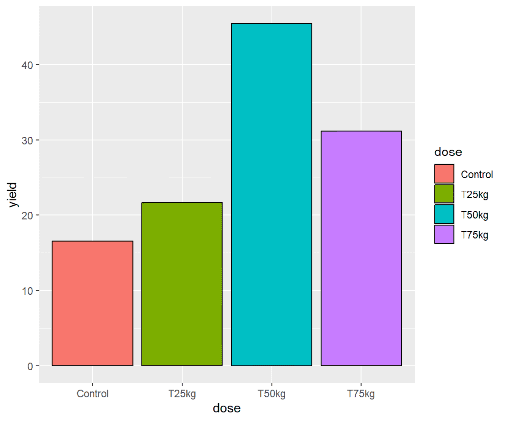
Adding error bars
In ggplot, the geom_errorbar() function is used to add error bars to a plot. Error bars are used to indicate the variability or uncertainty in the data, typically by displaying the standard deviation, standard error, or confidence intervals around the mean or median of the data.
We need to specify ymax and ymin values to display the error bars and adjust their positions by using position_dodge().
plot <- plot +
          geom_errorbar(aes(x = dose,
                            ymax = yield + SE,
                            ymin = yield - SE),
                        position = position_dodge(width=0.9),
                        width = 0.25)
plot
Displaying lettering on each bar
In ggplot, the geom_text() function is used to add text labels to a plot. This function allows you to specify the x and y coordinates of the text, as well as the text itself, and any additional formatting such as the font size, font color, and font style. In this example we shall add lettering (alphabets) to each bar.
plot <- plot +
          geom_text(aes(x = dose,
                        y = yield + SE,
                        label = as.matrix(df2$groups)),
                    position = position_dodge(width = 0.9),
                    vjust = -(0.5))
plot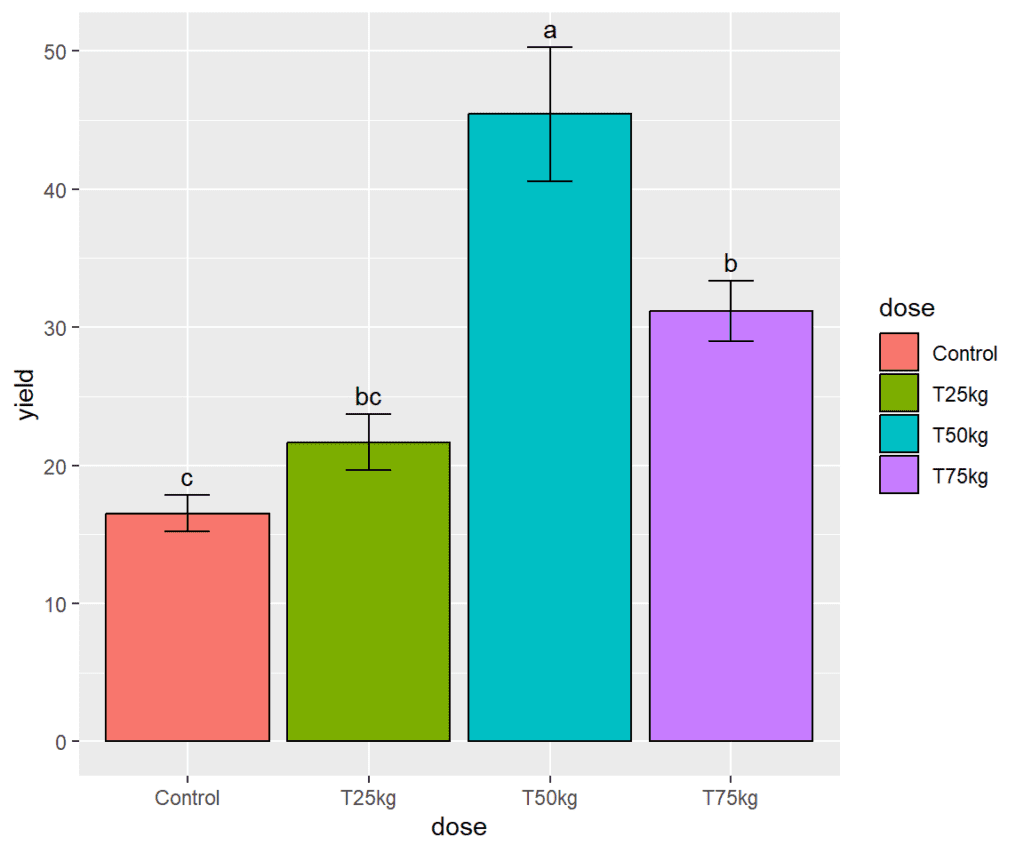
Changing themes
In ggplot, the theme() function is used to customize the appearance of a plot. This function allows you to modify the visual elements of a plot, such as the background color, axis labels, legend, and more. We shall use theme_bw() default settings to change the appearance of the plot.
plot <- plot +
          theme_bw()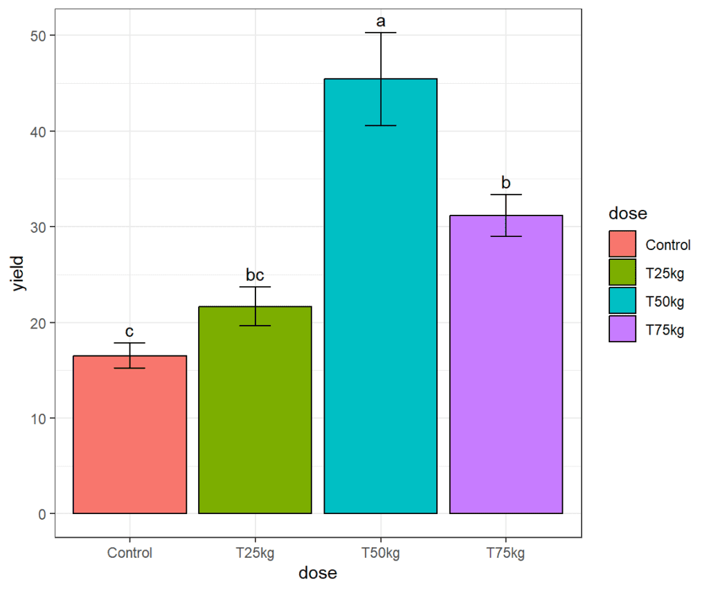
Customizing fill color
scale_fill_manual is a function in the ggplot2 package used to set the colors of the fill aesthetic in a plot manually. It allows you to specify the colors of the fill aesthetic using a named vector, where the names are the values that you want to map to specific colors. Here we shall manually add colors by using hex codes for the fill colors.
plot + scale_fill_manual(values = c("#0f993d", "#5b4080", "#e57717", "#66b1cc"))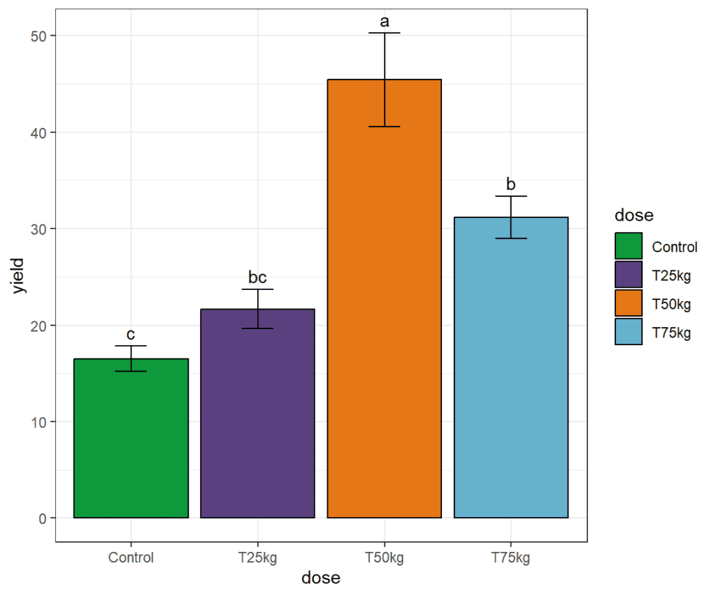
Download R program — Click_here
Download R studio — Click_here

Pingback: Split plot analysis in R – AGRON INFO TECH