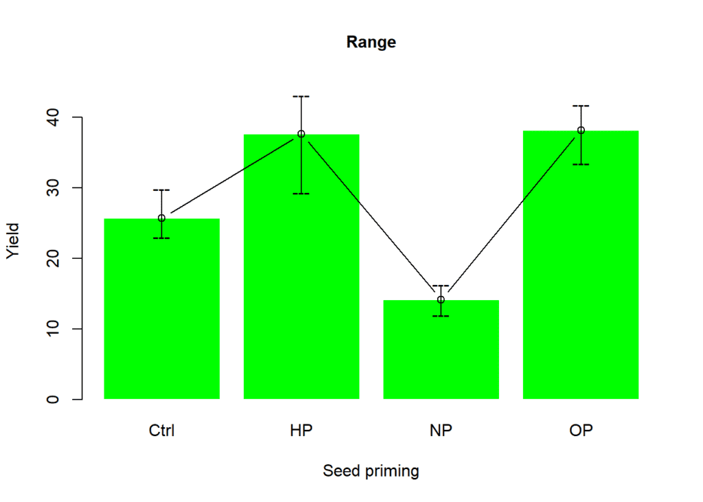
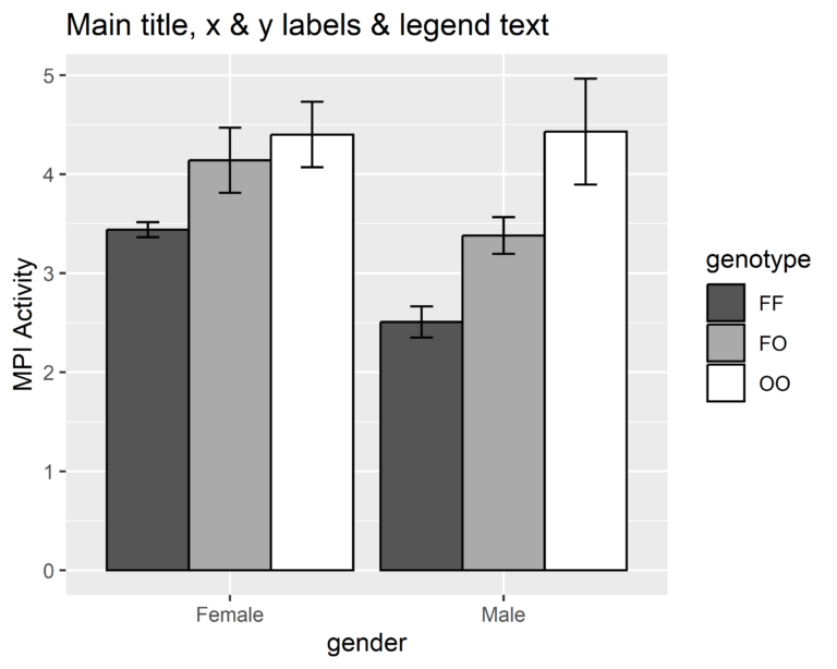
One of the most popular types of graphics is the barplot (also known as barchart). This chart is used to show the relationship between a numerical and a categorical variable in the dataset. In this post we shall create a barplot using barplot function from graphics package in R. We shall learn how to use various arguments from this function while creating barplot.
Contents
Creating dataset
We shall create a dummy data using rnorm function to generate a vector of 10 values for each level of factor variable viz. NP, HP, OP. The vectors were then combined using cbind function as a data frame. We used pivot_longer function from tidyr package to convert this data frame to a longer form. This dataset is stored as an object df.
library(dplyr)
set.seed(123)
HP <- rnorm(n = 10, mean = 13, sd = 2.5)
NP <- rnorm(n = 10, mean = 23, sd = 7.5)
OP <- rnorm(n = 10, mean = 43, sd = 12.5)

yield <- as.data.frame(cbind(HP, NP, OP))

df <- yield %>% tidyr::pivot_longer(everything(),
                                    names_to = "priming",
                                    values_to = "yield")
df
# # A tibble: 30 x 2 # priming yield # <chr> <dbl> # 1 HP 11.6 # 2 NP 32.2 # 3 OP 29.7 # 4 HP 12.4 # 5 NP 25.7 # 6 OP 40.3 # 7 HP 16.9 # 8 NP 26.0 # 9 OP 30.2 # 10 HP 13.2 # # … with 20 more rows
The structure of the variables is pretty fine however the variable priming is a factor variable and is being read as character. This may influence analysis results but for graphical representation we may proceed with character structure for factor variable.
str(df)# tibble [30 × 2] (S3: tbl_df/tbl/data.frame) # $ priming: chr [1:30] "HP" "NP" "OP" "HP" ... # $ yield : num [1:30] 11.6 32.2 29.7 12.4 25.7 ...
Calculating mean values for each factor level
The mean values were computed for each level of factor variable using the aggregate function from stats package in R and stored in an object df2.
df2 <- aggregate(x = yield ~ priming, data = df, FUN = mean)
df2
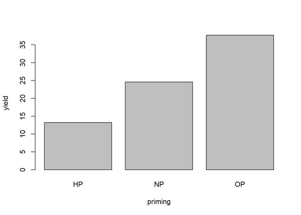
# priming yield # 1 HP 13.18656 # 2 NP 24.56466 # 3 OP 37.69301
Visualizing variables in a barplot
The graphics package, also known as the base graphics system, offers a comprehensive set of methods for constructing a wide range of plots as well as capabilities for fine-tuning such plots.
In the barplot function specify the formula argument as in this case yield is separated by priming. The tilde (~) is used for separation between response and factor variables. There are a lot of arguments that control this barplot function and you can access these in help section by simply typing ?barplot or help(barplot) in R console.
barplot(
          # Specifying formula
          formula = yield ~ priming,
          # Dataset
          data = df2
)
Adding title, X and Y axis labels
To specify title, X axis and Y axis labels in barplot function we can use arguments main, xlab and ylab, respectively.
barplot(
          formula = yield ~ priming,
          data = df2,
          # Adding main title
          main = "Barplot showing yield for each level of priming",
          # Specifying X and Y axis title
          xlab = "Seed priming",
          ylab = "Yield"
)
Changing color
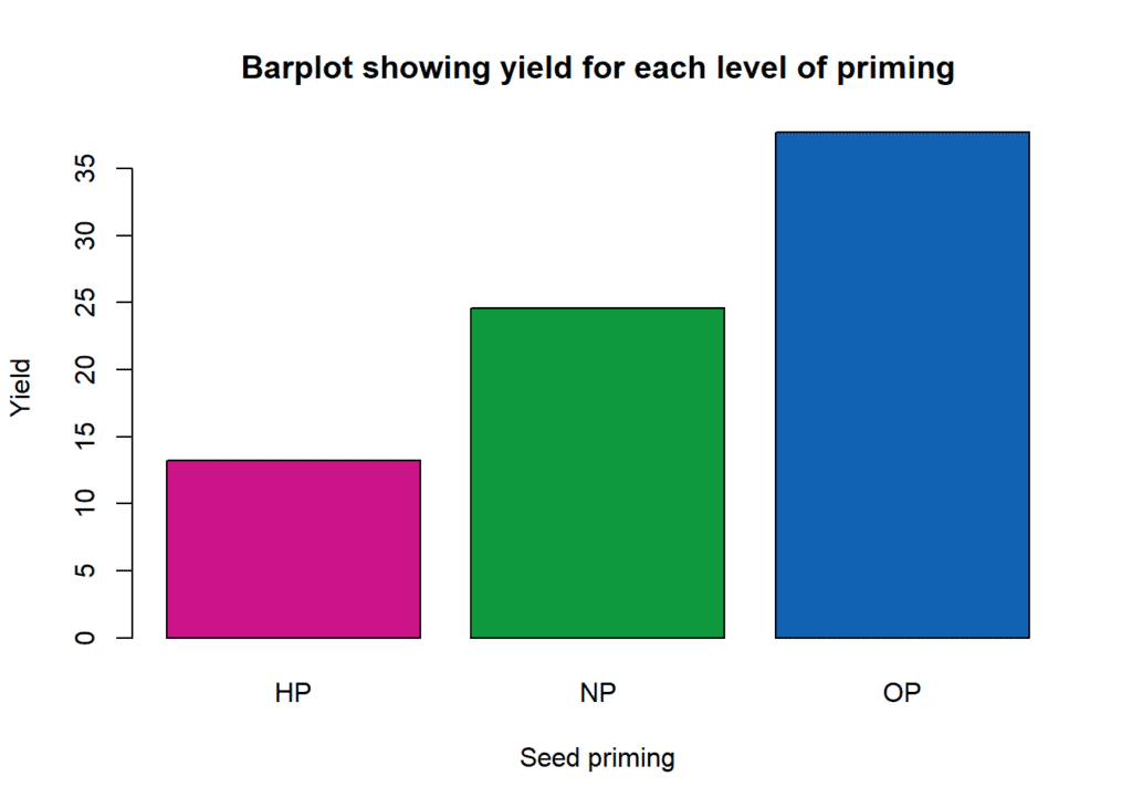
You can use custom colors to highlight each factor level by using col argument.
barplot(
          formula = yield ~ priming,
          data = df2,
          main = "Barplot showing yield for each level of priming",
          xlab = "Seed priming",
          ylab = "Yield",
          # Specifying colors for the bars
          col = c("#cc1489", "#0f993d", "#1262b3")
)
Adding legends
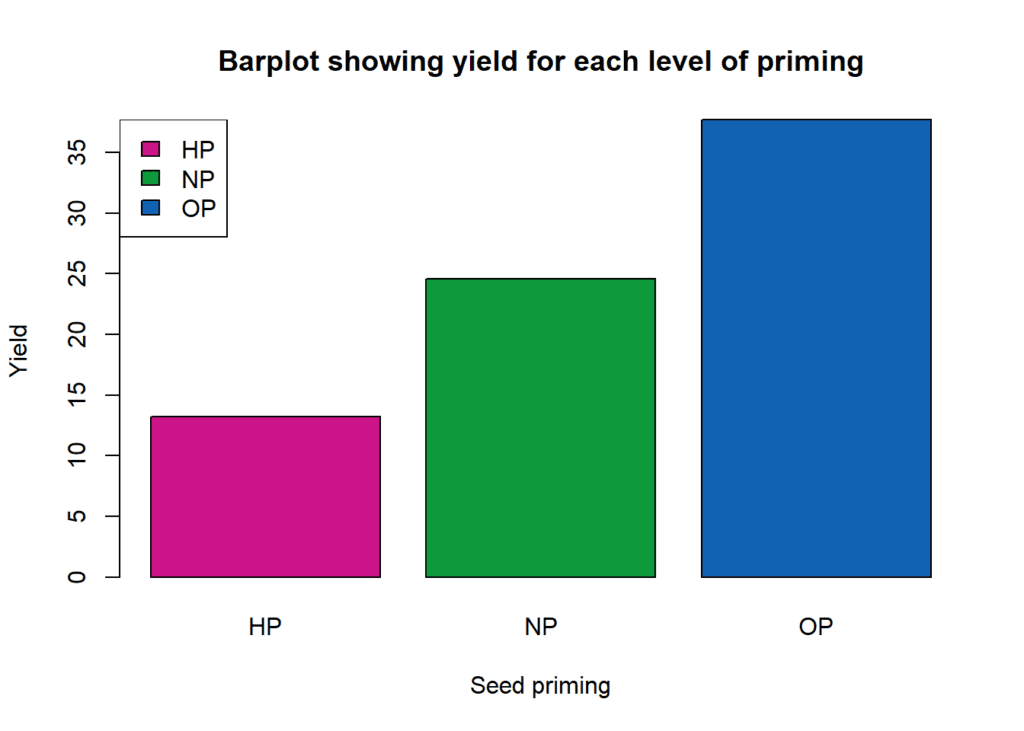
Legends can be added to plots by using legend function. You can specify position of the legend, labels for each factor level and assign colors. You can specify position of the legend using top, left, right, bottom and their combinations.
barplot(formula = yield ~ priming,
        data = df2,
        main = "Barplot showing yield for each level of priming",
        xlab = "Seed priming",
        ylab = "Yield",
        col = c("#cc1489", "#0f993d", "#1262b3"))

legend(
          # Setting position of the legend
          "topleft",
          # Factor levels for the legend
          c("HP","NP", "OP"),
          # Fill color of the legend
          fill = c("#cc1489", "#0f993d", "#1262b3")
)
You can also specify the position of the legend by using the X and Y axis coordinates. Further you can set the size of the legend text by using cex argument in legend function.
barplot(formula = yield ~ priming,
        data = df2,
        main = "Barplot showing yield for each level of priming",
        xlab = "Seed priming",
        ylab = "Yield",
        col = c("#cc1489", "#0f993d", "#1262b3"))

legend(
          # X and Y coordinates
          x = 0.2, y = 34,
          c("HP","NP", "OP"),
          fill = c("#cc1489", "#0f993d", "#1262b3"),
          # Control size of the legend text
          cex = 1.3
)
Scaling axis
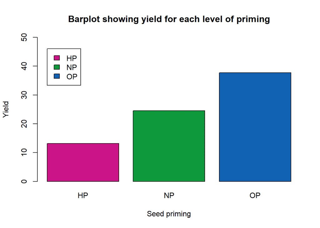
The base graphics system’s automatically produced axes will typically be sufficient for a plot. Even if the data being plotted on an axis are not numerical, this is still true. In our example we shall not customize limits for X axis as the variable is categorical and default limits will be sufficient. However, we can change the y axis limits by using ylim argument in barplot function.
# Creating barplot
barplot(formula = yield ~ priming,
        data = df2,
        main = "Barplot showing yield for each level of priming",
        xlab = "Seed priming",
        ylab = "Yield",
        col = c("#cc1489", "#0f993d", "#1262b3"),
        # Customizing Y axis limits
        ylim = c(0,50)
)
# Adding legend
legend(
          x = 0.2, y = 46,
          c("HP","NP", "OP"),
          fill = c("#cc1489", "#0f993d", "#1262b3")
)
Next, a specific place for each tick is drawn on the main y-axis to represent the Centigrade scale. The at argument specifies the placements of the tick marks for the axis, and the value 2 indicates that the axis should be drawn in margin 2 (the left margin).
# Creating barplot
barplot(formula = yield ~ priming,
        data = df2,
        main = "Barplot showing yield for each level of priming",
        xlab = "Seed priming",
        ylab = "Yield",
        col = c("#cc1489", "#0f993d", "#1262b3"),
        # Customizing Y axis limits
        ylim = c(0,50)
)
# Adding legend
legend(
          x = 0.2, y = 46,
          c("HP","NP", "OP"),
          fill = c("#cc1489", "#0f993d", "#1262b3")
)

# Specifying tick marks for the Y axis
axis(2, at = seq(0, 50, 5))
Adding box aroung the plot
The function box can be used to draw a box around the current plot and we can specify color and linetype for the box using col and lty arguments.
# Creating barplot
barplot(formula = yield ~ priming,
        data = df2,
        main = "Barplot showing yield for each level of priming",
        xlab = "Seed priming",
        ylab = "Yield",
        col = c("#cc1489", "#0f993d", "#1262b3"),
        # Customizing Y axis limits
        ylim = c(0,50)
)
# Adding legend
legend(
          x = 0.2, y = 46,
          c("HP","NP", "OP"),
          fill = c("#cc1489", "#0f993d", "#1262b3")
)

# Specifying tick marks for the Y axis
axis(2, at = seq(0, 50, 5))
# Adding box
box(col="gray", lty = "solid")
Adding horizontal line
Finally, we can add horizontal lines to indicate the mean value of the response variable as y-value cut-off.
# Creating barplot
barplot(formula = yield ~ priming,
        data = df2,
        main = "Barplot showing yield for each level of priming",
        xlab = "Seed priming",
        ylab = "Yield",
        col = c("#cc1489", "#0f993d", "#1262b3"),
        # Customizing Y axis limits
        ylim = c(0,50)
)
# Adding legend
legend(
          x = 0.2, y = 46,
          c("HP","NP", "OP"),
          fill = c("#cc1489", "#0f993d", "#1262b3")
)

# Specifying tick marks for the Y axis
axis(2, at = seq(0, 50, 5))
# Adding box
box(col="gray", lty = "solid")

abline (h = mean(df$yield), col="red", lty = "dashed")
Showing SE on each bar
We shall first compute the mean and standard error for the response variable (yield) grouped by priming using pipe operator from dplyr package. The results are stored in an object called df3.
df3 <- df %>%
          group_by(priming) %>%
          summarise(yield2 = mean(yield),
                    se = sd(yield)/sqrt(10))
df3
# # A tibble: 3 x 3 # priming yield2 se # <chr> <dbl> <dbl> # 1 HP 13.2 0.754 # 2 NP 24.6 2.46 # 3 OP 37.7 3.68
Using df3 we can produce the same barplot and then SE can be shown by using arrows function.
# Creating barplot
plot <- barplot(formula = yield2 ~ priming,
        data = df3,
        main = "Barplot showing yield for each level of priming",
        xlab = "Seed priming",
        ylab = "Yield",
        col = c("#cc1489", "#0f993d", "#1262b3"),
        # Customizing Y axis limits
        ylim = c(0,50)
)
# Adding legend
legend(
          x = 0.2, y = 46,
          c("HP","NP", "OP"),
          fill = c("#cc1489", "#0f993d", "#1262b3")
)

# Specifying tick marks for the Y axis
axis(2, at = seq(0, 50, 5))
# Adding box
box(col="gray", lty = "solid")

abline (h = mean(df$yield), col="red", lty = "dashed")
# Adding SE bars
arrows(x0 = plot,
       y0 = df3$yield2 + df3$se,
       y1 = df3$yield2 - df3$se,
       angle = 90,
       code = 3,
       length = 0.1)
If you have any questions feel free to ask. You can send your queries as an email at agron.infotech@gmail.com
Download R program — Click here
Download R studio — Click here

