Contents
Introduction
In this blog post, we’ll show you how to quickly create a summary table that can unlock valuable insights from your data. Not only will we walk you through the code step by step, but we’ll also highlight the significance of this table.
Package Loading
Let’s load the libraries needed for our analysis. These packages will enable us to create our summary table in publication ready style.
# Loading packages
library(dplyr)
library(purrr)
library(flextable)
Importing dataset
Let’s introduce our data first. We have a dataset called “df” that includes different study-related factors. Among them are “rep,” “priming,” “aba,” “apx,” “pod,” and “ph.”
We load this data into R, a powerful data analysis tool. The “df” dataset contains multiple observations, each with a “priming” category. Our goal is to create a summary table that showcases the mean and standard error (SE) for specific variables within each “priming” category.
# Creating data
df <- data.frame(
  rep = c(1, 2, 3, 1, 2, 3, 1, 2, 3),
  priming = c("NP", "NP", "NP", "HP", "HP", "HP", "OP", "OP", "OP"),
  aba = c(4.60, 5.70, 4.10, 7.10, 5.60, 6.30, 8.00, 7.40, 7.80),
  apx = c(0.90, 0.77, 0.81, 0.97, 0.91, 0.87, 1.73, 1.63, 1.45),
  pod = c(3.78, 4.40, 5.33, 6.73, 6.31, 5.40, 8.38, 7.40, 7.63),
  ph = c(91, 82, 87, 94, 87, 82, 110, 96, 92)
)

print(df)
# rep priming aba apx pod ph # 1 1 NP 4.6 0.90 3.78 91 # 2 2 NP 5.7 0.77 4.40 82 # 3 3 NP 4.1 0.81 5.33 87 # 4 1 HP 7.1 0.97 6.73 94 # 5 2 HP 5.6 0.91 6.31 87 # 6 3 HP 6.3 0.87 5.40 82 # 7 1 OP 8.0 1.73 8.38 110 # 8 2 OP 7.4 1.63 7.40 96 # 9 3 OP 7.8 1.45 7.63 92
To get started, we need to choose the variables we want to summarize. In this case, we’ve selected “aba,” “apx,” “pod,” and “ph.”
# Create a vector of variable names to summarize
variables_to_summarize <- names(df[,-c(1,2)])
variables_to_summarize
# [1] "aba" "apx" "pod" "ph"
Initializing summary table
Now, let’s initialize an empty list called “summary_list” to store our summary results. This list will be crucial as we progress through the analysis.
summary_list <- list()Here comes the heart of our analysis. We’re going to calculate the mean and SE for each selected variable, grouped by the “priming” category. This is where the magic happens!
We loop through each selected variable and create a summary table for it. This summary table contains the mean value and the SE, both calculated within their respective “priming” groups. To ensure clarity, we rename the columns to match the variable name. This will make it easier to identify which variable each table represents.After creating each summary table, we add it to our “summary_list.” This list will ultimately contain all our summary results.
# Loop through each variable and summarize by priming group
for (variable in variables_to_summarize) {
  summary_result <- df %>%
    group_by(priming) %>%
    summarize(
      mean_val = mean(.data[[variable]], na.rm = TRUE),
      SE = sd(.data[[variable]], na.rm = TRUE) / sqrt(n())
    )
  summary_result <- rename(summary_result, !!variable := mean_val)
  summary_list[[variable]] <- summary_result
}


# Print the summary data frame
print(summary_list)
# $aba # # A tibble: 3 × 3 # priming aba SE # <chr> <dbl> <dbl> # 1 HP 6.33 0.433 # 2 NP 4.8 0.473 # 3 OP 7.73 0.176 # # $apx # # A tibble: 3 × 3 # priming apx SE # <chr> <dbl> <dbl> # 1 HP 0.917 0.0291 # 2 NP 0.827 0.0384 # 3 OP 1.60 0.0819 # # $pod # # A tibble: 3 × 3 # priming pod SE # <chr> <dbl> <dbl> # 1 HP 6.15 0.393 # 2 NP 4.50 0.450 # 3 OP 7.80 0.296 # # $ph # # A tibble: 3 × 3 # priming ph SE # <chr> <dbl> <dbl> # 1 HP 87.7 3.48 # 2 NP 86.7 2.60 # 3 OP 99.3 5.46
Formatting summary table
Now that we have our summary results, it’s time to make them visually appealing and easy to interpret. This step involves merging the mean and SE values into a single, informative column. We create an empty list called “formatted_summary” to store our formatted results. This is where we’ll enhance the clarity of our tables.
# Create an empty list to store the formatted tibbles
formatted_summary <- list()
We loop through each element in the “summary_list,” and for each table, we merge the mean and SE values into a single column, separated by a plus-minus sign. To keep our tables clean, we remove the original variables containing mean, SE, SE merged columns, leaving us with the essential information. Finally, we ensure that our variable names are free from any “_merged_column” suffix.
# Loop through each element in the summary_list
for (var_name in names(summary_list)) {
  # Merge the aba and SE columns with a plus-minus sign and store in a new column
  formatted_tibble <- summary_list[[var_name]] %>%
    mutate_at(vars(-priming),
              list(merged_column = ~paste0(round(.x, 2),
                                           " ± ",
                                           round(SE, 2))))

  # Remove the original SE columns
  formatted_tibble <- formatted_tibble %>%
    select(-SE, -var_name, -SE_merged_column)

  formatted_tibble <- formatted_tibble %>%
    rename_all(~gsub("_merged_column", "", .))

  # Add the formatted tibble to the formatted_summary list
  formatted_summary[[var_name]] <- formatted_tibble
}

print(formatted_summary)
# $aba # # A tibble: 3 × 2 # priming aba # <chr> <chr> # 1 HP 6.33 ± 0.43 # 2 NP 4.8 ± 0.47 # 3 OP 7.73 ± 0.18 # # $apx # # A tibble: 3 × 2 # priming apx # <chr> <chr> # 1 HP 0.92 ± 0.03 # 2 NP 0.83 ± 0.04 # 3 OP 1.6 ± 0.08 # # $pod # # A tibble: 3 × 2 # priming pod # <chr> <chr> # 1 HP 6.15 ± 0.39 # 2 NP 4.5 ± 0.45 # 3 OP 7.8 ± 0.3 # # $ph # # A tibble: 3 × 2 # priming ph # <chr> <chr> # 1 HP 87.67 ± 3.48 # 2 NP 86.67 ± 2.6 # 3 OP 99.33 ± 5.46
Combining summary tables
With our individual tables looking sleek and informative, it’s time to combine them into a single, comprehensive summary table. We used imap function to iterate through the elements of formatted summary list to exclude the first column. Then we use the “bind_cols” function to merge the tables from combined summary list. This ensures that our final table remains organized and easy to read.
combined_summary <- formatted_summary %>%
  imap(~ {
    if (.y == 1) {
      .x
    } else {
      select(.x, -1)  # Exclude the first column for the rest of the lists
    }
  }) %>%
  reduce(bind_cols)

combined_summary
# # A tibble: 3 × 4 # aba apx pod ph # <chr> <chr> <chr> <chr> # 1 6.33 ± 0.43 0.92 ± 0.03 6.15 ± 0.39 87.67 ± 3.48 # 2 4.8 ± 0.47 0.83 ± 0.04 4.5 ± 0.45 86.67 ± 2.6 # 3 7.73 ± 0.18 1.6 ± 0.08 7.8 ± 0.3 99.33 ± 5.46
We add the row names to our final table, making it more informative.
# Adding the row names
combined_summary <- bind_cols(summary_list[[1]][1],
                              combined_summary)
Creating summary table using flextable package
We’re going to use the powerful “flextable” package to create the final table that can be compiled to MS word file. We’re adjusting column widths, highlighting the header, and even adding a caption to make it clear and visually appealing. This table provides a comprehensive overview of the summary of the data.
# Creating the summary table using flextable
table <- flextable(data = combined_summary) %>%
  # Increasing column width
  width(width = 1) %>%
  # Formatting the table header
  bold(bold = TRUE, part = "header") %>%
  # Adding table caption
  set_caption(caption = "Table 1: Effect of seed priming on enzyme activity")

table| priming | aba | apx | pod | ph |
|---|---|---|---|---|
| HP | 6.33 ± 0.43 | 0.92 ± 0.03 | 6.15 ± 0.39 | 87.67 ± 3.48 |
| NP | 4.8 ± 0.47 | 0.83 ± 0.04 | 4.5 ± 0.45 | 86.67 ± 2.6 |
| OP | 7.73 ± 0.18 | 1.6 ± 0.08 | 7.8 ± 0.3 | 99.33 ± 5.46 |
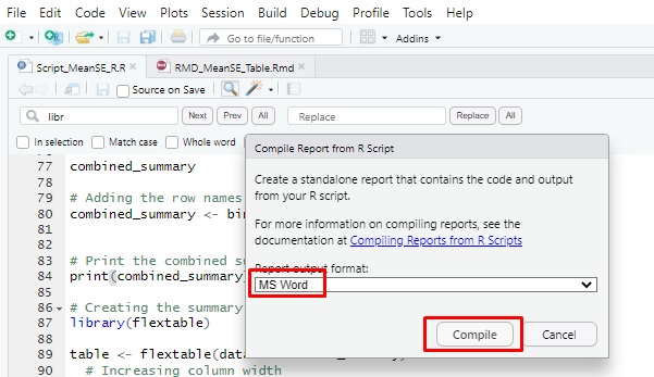
Next, navigate to the “Compile Report” icon and select Microsoft Word from the dropdown menu. Simply click the “Compile” button, and it will generate the table within your MS Word document.
knitr::include_graphics("Images/Screenshot_4.png")
And there you have it, our beautifully crafted summary table!
knitr::include_graphics("Images/Screenshot_5.png")
But why is it so important, you might ask?
In many research publications, it’s common to present mean and standard error values in tabular format. To simplify this process within R, we’ve developed an effortless and efficient method, and it’s not limited to just this dataset. You can use the same code structure for other datasets by simply changing the variable name you want to summarize.
Conclusion
We started by introducing our dataset and selecting the variables we wanted to analyze. We then demonstrated how to calculate the mean and standard error (SE) for each variable, grouped by a specific category. This step is crucial for understanding the data and extracting meaningful insights. We walked you through the entire process, from formatting the tables to merging values and combining multiple tables into a single, comprehensive summary.
Stay tuned for more data-driven content and happy analyzing! 🤓
Download R program —
Click_hereDownload R studio —
Click_here


