Welcome back to AGRON Info-Tech! In today’s blog post, we’re diving into the fascinating world of Time Series Analysis in R. If you’ve ever wondered how to dissect and understand time-dependent data, you’re in the right place. We’ll be exploring the “AirPassengers” dataset step by step, from visualization to model selection. So, let’s get started!
📃 This blog post provides a step-by-step guide on performing Time Series Analysis in R. It covers essential aspects like data visualization, seasonality identification, stationarity, model parameter selection, model interpretation, and residual analysis. The provided R code snippets and explanations make it easy for readers to follow along.
Contents
Visualize the data
Our journey begins with visualizing the data. We want to uncover any hidden patterns, trends, or seasonality within the “AirPassengers” dataset. To do this, we’ll use R and a few essential libraries.
First, we load the necessary libraries, including ggplot2, to help us with plotting.
library(ggplot2)Now, let’s create a plot of the time series data:
The ggplot() function initializes the plotting environment, and geom_line() is used to draw a line chart. We’re mapping the x-axis to the time component of the “AirPassengers” dataset, which typically represents years, and the y-axis to the corresponding passenger count. The labs() function is employed to set labels for the x and y axes, ensuring clarity in the plot. Lastly, theme_minimal() is applied to give the plot a clean and minimalist appearance.
ggplot() +
  geom_line(aes(x = time(AirPassengers), y = AirPassengers)) +
  labs(x = "Year", y = "Passenger Count") +
  theme_minimal()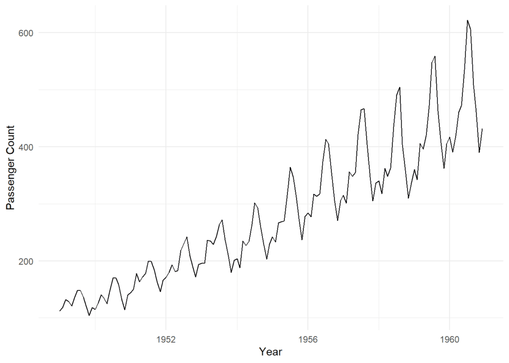
The plot reveals some exciting insights. We see a clear upward trend and a repeating pattern approximately every 12 months, indicating both trend and seasonality.
Identify Seasonality
Next, we delve into identifying seasonality. We notice a 12-month pattern, but let’s investigate further. To do that, we’ll employ the ACF and PACF plots. These help us determine potential values for ‘p’ and ‘q’.
We begin by setting up a plotting grid with two rows and one column using par() function. This arrangement allows us to display both the ACF and PACF plots side by side for easy comparison. The acf() function generates the ACF plot, which shows how each data point correlates with its lagged values up to a specified maximum lag (in this case, 36 months). Significant spikes or patterns in the ACF plot can indicate seasonality.
Similarly, the pacf() function creates the PACF plot, which focuses on the direct correlation between a data point and its lags while removing the influence of earlier lags. Significant spikes in the PACF plot can help identify potential values for the ‘p’ parameter in SARIMA modeling, indicating non-seasonal orders.
library(forecast)

# Create ACF and PACF plots
par(mfrow=c(2,1))
acf(AirPassengers, lag.max=36)
pacf(AirPassengers, lag.max=36)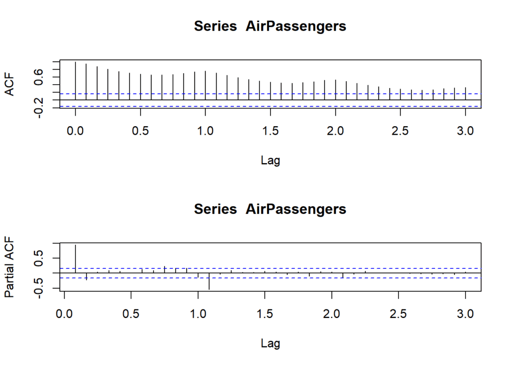
In the ACF plot, we observe significant spikes at lags 12, 24, and 36, indicating a possible seasonal order of 12 (‘P’ in SARIMA terminology). The PACF plot displays a significant spike at lag 1, suggesting a possible non-seasonal order of 1 (‘p’ in SARIMA terminology).
Address Stationarity
Now, let’s address stationarity. We’ll apply first-order differencing to make the data stationary.
This piece of R code performs a crucial step in time series analysis, known as “first-order differencing”. The code calculates the difference between consecutive values in the “AirPassengers” dataset and stores the result in a new variable called AirPassengers_diff.
Subsequently, it creates a line plot using the ggplot2 library to visualize the differenced data. In this plot, the x-axis represents time (likely in years), while the y-axis shows the differences between consecutive passenger counts. This transformation is done to make the data more stationary, which is a fundamental requirement for many time series models.
# First-order differencing
AirPassengers_diff <- diff(AirPassengers)

# Plot differenced data
ggplot() +
  geom_line(aes(x = time(AirPassengers_diff), y = AirPassengers_diff)) +
  labs(x = "Year", y = "Differenced Passenger Count") +
  theme_minimal()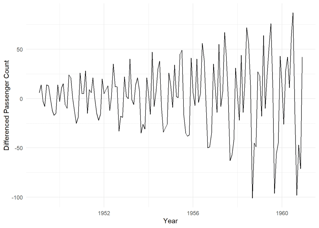
The differenced data appears more stationary, with fluctuations around a constant mean. Further differencing may not be necessary.
Grid Search for Model Parameters
With our data prepped, it’s time for the grid search. We’ll try different model orders (p, d, q, P, D, Q) to find the best fit.
The below R code is responsible for performing a grid search to find the best-fitting Seasonal AutoRegressive Integrated Moving Average (SARIMA) model for time series analysis. Here’s a breakdown of what the code accomplishes:
- Initialization: Two variables,
best_modelandbest_aic, are initialized.best_modelwill store the SARIMA model with the lowest AIC (Akaike Information Criterion), whilebest_aicstarts with a value of infinity, representing the highest possible AIC. - Parameter Ranges: A range of values is defined for the SARIMA model parameters:
p_values,d_values, andq_valuesfor non-seasonal orders.P_values,D_values, andQ_valuesfor seasonal orders.mis set to 12, representing the seasonal period (usually 12 for monthly data).
- Nested Loops: The code then enters nested loops to iterate through all possible combinations of the defined parameters. This results in an exhaustive search over a wide range of model orders.
- SARIMA Model Fitting: Within the nested loops, the code attempts to fit a SARIMA model using the current parameter values. It utilizes the
arima()function with the specified orders for both non-seasonal and seasonal components. Any errors encountered during model fitting are caught and handled. - AIC Calculation: If the model fitting is successful (i.e., no error is thrown), the code calculates the AIC for the fitted model. The AIC serves as a measure of model quality, with lower AIC values indicating better model fits.
- Updating the Best Model: The code compares the AIC of the current model with the lowest AIC encountered so far (
best_aic). If the current model has a lower AIC, it becomes the new “best_model,” and its AIC value is stored inbest_aic. - Print Results: After all combinations have been evaluated, the code prints out the best-fitting SARIMA model and its associated AIC.
This process helps identify the SARIMA model that optimally captures the underlying patterns in the time series data, making it a crucial step in time series analysis and forecasting.
# Initialize variables for the best model
best_model <- NULL
best_aic <- Inf

# Define a range of values for p, d, and q
p_values <- 0:3
d_values <- 0:1
q_values <- 0:3

# Define a range of values for seasonal P, D, and Q (for SARIMA)
P_values <- 0:1
D_values <- 0:1
Q_values <- 0:1
m <- 12  # Seasonal period (12 for monthly data)

# Loop through parameter combinations
for (p in p_values) {
  for (d in d_values) {
    for (q in q_values) {
      for (P in P_values) {
        for (D in D_values) {
          for (Q in Q_values) {
            # Fit the SARIMA model
            model <- tryCatch(
              {
                fit <- arima(AirPassengers, order = c(p, d, q),
                             seasonal = list(order = c(P, D, Q), period = m),
                             xreg = NULL)
                fit
              },
              error = function(e) e
            )

            # Check if the model fit was successful
            if (!inherits(model, "error")) {
              # Calculate AIC for the model
              aic <- AIC(model)

              # Update best model if current model has lower AIC
              if (aic < best_aic) {
                best_model <- model
                best_aic <- aic
              }
            }
          }
        }
      }
    }
  }
}

# Print the best model and its AIC
print(best_model)
# # Call: # arima(x = AirPassengers, order = c(p, d, q), seasonal = list(order = c(P, D, # Q), period = m), xreg = NULL) # # Coefficients: # ar1 ar2 ar3 ma1 ma2 ma3 sar1 # -0.2026 -0.1633 0.7272 -0.0745 0.1346 -0.9679 -0.1946 # s.e. 0.0761 0.0776 0.0760 0.0483 0.0510 0.0706 0.0966 # # sigma^2 estimated as 113: log likelihood = -498.85, aic = 1013.69
cat("Best AIC:", best_aic)# Best AIC: 1013.693
After the search, we’ve found the best-fitting model with its parameter values. The AIC value helps us determine the goodness of fit.
Model Specification
- Let’s dive into the specifics of our model. It’s crucial to understand the coefficients and what they signify. Our best-fitting model has non-seasonal ARIMA orders of (p = 3, d = 1, q = 3) and seasonal ARIMA orders of (P = 1, D = 1, Q = 1, m = 12).
- Our model’s estimated variance (sigma^2) is approximately 113, with a log likelihood of -498.85. The AIC value for this model is 1013.69.
Model Fit and Interpretation
These values tell us that our model effectively captures both non-seasonal and seasonal patterns. The AR and MA coefficients indicate the model’s ability to account for autocorrelation and moving average effects. The lower AIC value suggests a better-fitting model among those we’ve tested.
However, our journey doesn’t end here. We must ensure our model is reliable. We do this by testing the residuals for white noise.
Residual analysis of the best model
- Residual Calculation: Calculate the residuals from the “best_model”.
- ACF and PACF Plots: Create two plots to check for autocorrelation in the residuals. ACF shows general correlation, and PACF shows direct correlation.
- Ljung-Box Test: Test for autocorrelation in the residuals, up to a lag of 20. It assesses if the autocorrelations are significant.
- Histogram and QQ Plot: Create a histogram to visualize the distribution of residuals and a QQ plot to check if they follow a normal distribution.
- Shapiro-Wilk Test: Perform a statistical test to determine if the residuals are normally distributed, using a p-value.
# Check residuals of the best model
residuals <- residuals(best_model)

# Plot ACF and PACF of residuals
par(mfrow=c(2,1))
acf(residuals)
pacf(residuals)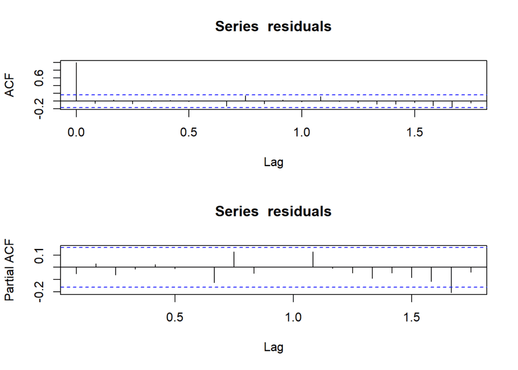
# Ljung-Box test for residual autocorrelation
Box.test(residuals, lag = 20, type = "Ljung-Box")
# # Box-Ljung test # # data: residuals # X-squared = 19.508, df = 20, p-value = 0.4891
# Histogram and QQ plot of residuals
par(mfrow=c(1,2))
hist(residuals, main = "Histogram of Residuals")
qqnorm(residuals)
qqline(residuals)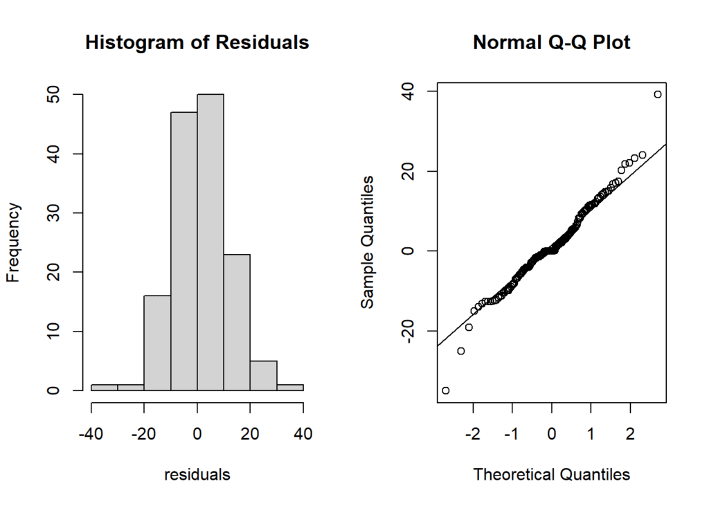
# Check if residuals are normally distributed and have constant variance
shapiro.test(residuals)
# # Shapiro-Wilk normality test # # data: residuals # W = 0.97729, p-value = 0.01703
Our residual analysis tells us that:
- Autocorrelation is not significant, as seen in the ACF and PACF plots.
- The Ljung-Box test supports the absence of significant residual autocorrelation.
- The residuals approximate a normal distribution, indicated by the histogram and QQ plot.
- The Shapiro-Wilk test suggests a slight departure from strict normality, possibly influenced by the sample size.
Conclusion
In summary, our best-fitting model has adequately captured the “AirPassengers” data’s underlying patterns. While there’s a minor departure from strict normality, it’s essential to consider this in your specific context. Remember to monitor your model’s performance and assess its forecasts with out-of-sample data.
Download R program —
Click_hereDownload R studio —
Click_here

