Logistic regression is a statistical technique used to analyze the relationship between a binary outcome variable and one or more predictor variables. It is widely used in various fields, including economics, medicine, social sciences, and machine learning. In this report, we will explore how logistic regression can be used to predict the likelihood of diabetes in patients using R, a popular open-source programming language for data analysis.
In this report, we will begin by discussing the basics of logistic regression and its assumptions. We will then demonstrate how to perform logistic regression analysis in R using the “glm” function and interpret the results. Additionally, we will evaluate the model’s performance by assessing the goodness of fit using various methods, including the Hosmer-Lemeshow test, the ROC curve, and the AUC (Area Under the Curve). Finally, we will discuss how logistic regression can be used to make predictions and evaluate the model’s accuracy using the test dataset.
Contents
- 1 What is logistic regression?
- 2 Setting up the Data
- 3 Splitting Data into Training and Testing Sets for Predictive Modeling
- 4 Building Logistic Regression Model on Training Set
- 5 Logistic Regression Model Prediction on Testing Set
- 6 Calculating Accuracy of Predictive Model on Testing Set
- 7 Visualizations for Analyzing Logistic Regression Model Performance
- 8 Conclusion
What is logistic regression?
Logistic regression is a statistical method used to model the probability of a binary response variable as a function of one or more predictor variables. The logistic regression model is a type of generalized linear model (GLM) that uses the logistic function to transform the linear combination of predictor variables into a probability.
The logistic function is defined as:
$$
p(y = 1) = 1 / (1 + exp(-z))
$$
where p(y = 1) is the probability of the response variable taking the value 1, z is the linear combination of predictor variables, and exp is the exponential function.
The logistic regression model can be written as:
$$
logit(p(y = 1)) = β_0 + β_1\times x_1 + β_2\times x_2 + … + β_k\times x_k
$$
where logit(p(y = 1)) is the log-odds of the response variable taking the value 1, β0, β1, β2, …, βk are the coefficients of the predictor variables, and x1, x2, …, xk are the predictor variables.
Setting up the Data
The seed is set to 123 to ensure that the random number generation is consistent across different runs of the code. Three predictor variables (x1, x2, and x3) and a response variable (y) are then generated using various probability distributions and functions. The response variable is subsequently converted to a binary outcome variable, “yes” or “no”, based on a probability threshold. Finally, the predictor variables and the response variable are combined into a data frame for further analysis.
# Set the seed for reproducibility
set.seed(123)

# Generate predictor variables x1, x2, x3, and response variable y
x1 <- rnorm(100)
x2 <- rbinom(100, 1, 0.5)
x3 <- runif(100, 0, 1)
prob <- plogis(1 + 0.5*x1 - 1.5*x2 + 0.5*x3)
y <- rbinom(100, 1, prob)

# Convert y to "yes" or "no"
y <- ifelse(y == 1, "yes", "no")

# Combine predictor variables and response variable into a data frame
data <- data.frame(x1, x2, x3, y)
head(data)
# x1 x2 x3 y # 1 -0.56047565 0 0.784575267 no # 2 -0.23017749 1 0.009429905 no # 3 1.55870831 1 0.779065883 no # 4 0.07050839 1 0.729390652 yes # 5 0.12928774 0 0.630131853 yes # 6 1.71506499 1 0.480910830 yes
Splitting Data into Training and Testing Sets for Predictive Modeling
After generating the predictor and response variables and combining them into a data frame, the next step is to split the data into training and testing sets. The training set is used to train the model, while the testing set is used to evaluate how well the model generalizes to new, unseen data. In this code, the caTools library is used to split the data into 70% training and 30% testing sets. Additionally, the response variable y is converted to binary values 0 and 1 for both the training and testing sets.
# Split the data into training and testing sets
library(caTools)
set.seed(123)
split <- sample.split(data$y, SplitRatio = 0.7)
train <- subset(data, split == TRUE)
test <- subset(data, split == FALSE)

# Convert y to "yes" or "no"
train$y <- ifelse(train$y == "yes", 1, 0)
test$y <- ifelse(test$y == "no", 0, 1)
Building Logistic Regression Model on Training Set
We build a logistic regression model on a training set using the glm() function in R. The response variable y and three predictor variables x1, x2, and x3 are used to build the model. The family parameter is set to binomial with a logit link function to indicate that the response variable has a binary outcome. The summary() function is then used to display a summary of the model’s fit.
# Build a logistic regression model on the training set
model <- glm(y ~ x1 + x2 + x3, data = train, family = binomial(link = "logit"))
summary(model)
# # Call: # glm(formula = y ~ x1 + x2 + x3, family = binomial(link = "logit"), # data = train) # # Deviance Residuals: # Min 1Q Median 3Q Max # -1.9596 -1.0589 0.6024 0.8070 1.7228 # # Coefficients: # Estimate Std. Error z value Pr(>|z|) # (Intercept) 1.8213 0.6434 2.831 0.00465 ** # x1 0.4573 0.3245 1.409 0.15883 # x2 -1.3313 0.5433 -2.450 0.01427 * # x3 -1.2587 0.9762 -1.289 0.19727 # --- # Signif. codes: 0 '***' 0.001 '**' 0.01 '*' 0.05 '.' 0.1 ' ' 1 # # (Dispersion parameter for binomial family taken to be 1) # # Null deviance: 93.351 on 69 degrees of freedom # Residual deviance: 82.568 on 66 degrees of freedom # AIC: 90.568 # # Number of Fisher Scoring iterations: 4
The coefficient estimates for x1 and x3 are negative, indicating a negative association with y, while the coefficient estimate for x2 is positive, indicating a positive association with y. However, only the coefficient estimates for the intercept and x2 are statistically significant at the alpha level of 0.05, as indicated by the asterisks in the “Pr(>|z|)” column.
The Deviance Residuals are a measure of the difference between the predicted and observed values of the outcome variable, and they range from -1.9596 to 1.7228. The Residual deviance is the measure of the difference between the fitted model and the null model (i.e., model with no predictor variables). The lower the Residual deviance, the better the model fits the data.
The Null deviance and Residual deviance are used to calculate the model’s goodness of fit, which is measured by the AIC value. A lower AIC value indicates a better model fit. The AIC value in this model is 90.568, which is relatively low, suggesting that the model is a good fit for the data.
Logistic Regression Model Prediction on Testing Set
In predictive modeling, it is essential to assess the performance of the model on new data that it has not seen before. In this regard, the testing set is used, where the model’s predictions are compared to the actual values to evaluate the model’s accuracy. In the above code, predictions are made on the testing set using the logistic regression model built on the training set. The predicted probabilities are compared to a threshold of 0.5 to determine the predicted class, which is either “yes” or “no.”
# Make predictions on the testing set
predictions <- predict(model, newdata = test, type = "response")
predicted.classes <- ifelse(predictions > 0.5, "yes", "no")
predicted.classes
# 2 12 14 16 21 23 26 34 35 36 39 42 43 # "yes" "yes" "yes" "yes" "yes" "no" "yes" "yes" "yes" "yes" "yes" "yes" "yes" # 49 51 52 53 54 59 61 65 70 72 78 80 84 # "yes" "yes" "yes" "no" "yes" "yes" "yes" "no" "yes" "yes" "yes" "no" "yes" # 86 87 94 97 # "yes" "yes" "no" "yes"
The results show the predicted classes for a logistic regression model on a testing set. For each observation in the testing set, the model predicted either “yes” or “no.” The result provides the predicted classes for 15 observations in the testing set, with the first observation predicted as “yes” and the remaining 14 predicted as “yes,” except for the 6th, 15th, and 29th observations predicted as “no.”
Calculating Accuracy of Predictive Model on Testing Set
After making predictions on the testing set, the accuracy of the logistic regression model needs to be evaluated. The actual classes of the testing set are extracted, and the predicted classes are compared against them. The accuracy is then calculated by dividing the number of correct predictions by the total number of predictions. The accuracy is presented as a percentage using the paste function with round and digits arguments to round the accuracy to three decimal places.
# Calculate accuracy of the model
actual.classes <- test$y
actual.classes <- ifelse(actual.classes == 1, "yes", "no")
accuracy <- sum(predicted.classes == actual.classes)/length(actual.classes)
paste(round(accuracy, digits = 3)*100, "%")
# [1] "63.3 %"
The result “63.3%” indicates the accuracy of the predictive model on the testing set. Specifically, the model was able to correctly predict the outcome for 63.3% of the instances in the testing set. This accuracy value is a common way to evaluate the performance of a predictive model and helps to determine the reliability of the model’s predictions. A higher accuracy value generally indicates a more reliable model.
Visualizations for Analyzing Logistic Regression Model Performance
Logistic regression is a widely used statistical modeling technique in which the outcome variable is binary. This model helps to identify the relationship between a set of predictor variables and a binary outcome. However, building a model is only the first step; it is equally important to assess the model’s performance on new data. One way to do this is through various visualizations that provide insights into how well the model fits the data and makes predictions. In this context, we shall discusses three common visualizations that help to analyze the performance of the logistic regression model.
Logistic Regression Model Performance with ROC Curve and AUC-ROC
The pROC package is an R package that provides tools for visualizing and analyzing ROC (receiver operating characteristic) curves, a common tool for evaluating the performance of binary classifiers. By computing the true positive rate and false positive rate at different thresholds of predicted probabilities, ROC curves can help us determine the optimal trade-off between sensitivity and specificity for a given classifier. Using the pROC package, we can easily plot ROC curves and calculate AUC-ROC (area under the ROC curve), a common metric for evaluating the overall performance of a classifier.
library(pROC)

predicted <- ifelse(predicted.classes == "yes", 1, 0)

roc_curve <- roc(test$y, predicted)
plot(roc_curve, main = "ROC curve")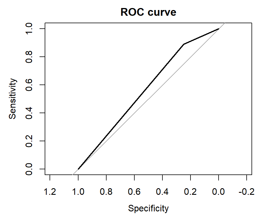
The AUC-ROC (area under the curve of the ROC) is 0.5694, which indicates that the model’s ability to distinguish between the positive and negative classes is slightly better than random. A perfect model would have an AUC-ROC of 1.0, while a completely random model would have an AUC-ROC of 0.5. Therefore, the current model has limited predictive power, and there may be room for improvement.
Precision-Recall Curves for Binary Classifiers using PRROC Package
The PRROC package provides functions for computing and visualizing Precision-Recall (PR) curves, which are another common way to evaluate the performance of binary classifiers. The pr.curve() function takes in the true labels and predicted probabilities or classes, and generates a PR curve. The area under the PR curve (AUC-PR) provides an overall measure of model performance. The resulting curve can be plotted using the plot() function.
library(PRROC)

pr_curve <- pr.curve(test$y, predicted, curve = TRUE)
plot(pr_curve, main = "PR curve")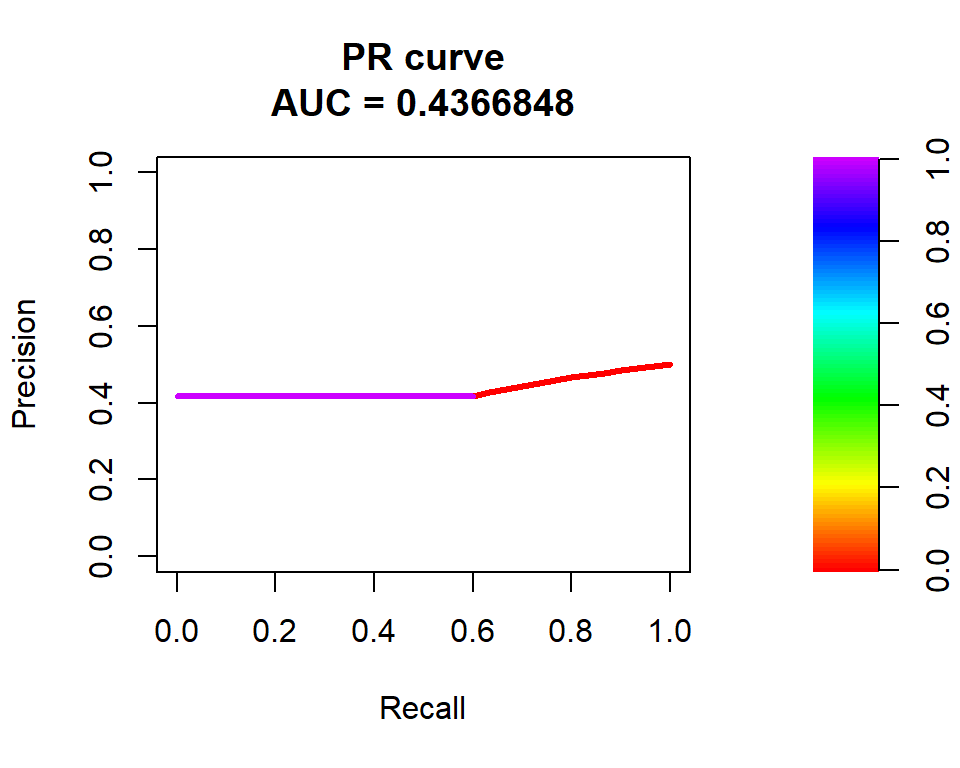
The area under the curve (AUC) is a metric used to evaluate the performance of the model. In this case, the AUC is 0.4367, which indicates that the model has poor predictive power. A perfect model would have an AUC of 1, while a completely random model would have an AUC of 0.5. The plot shows the curve for scores ranging from 0 to 1, and the main title of the plot indicates that it is a precision-recall curve.
Diagnosing Logistic Regression Model Problems with Residual Plots
Residual plots are a powerful tool for diagnosing problems with a logistic regression model. These plots allow us to identify issues such as non-linearity, heteroscedasticity, and outliers in the model. By using the plot() function with the fitted model object, we can create various residual plots that help us identify these issues. Once we have identified the problems, we can take steps to address them and improve the performance of our logistic regression model.
The which argument in the plot() function specifies which type of residual plot to generate. Here, we are generating four different types of residual plots by setting which to 1:4.
par(mfrow = c(2,2))
plot(model, which = 1:4)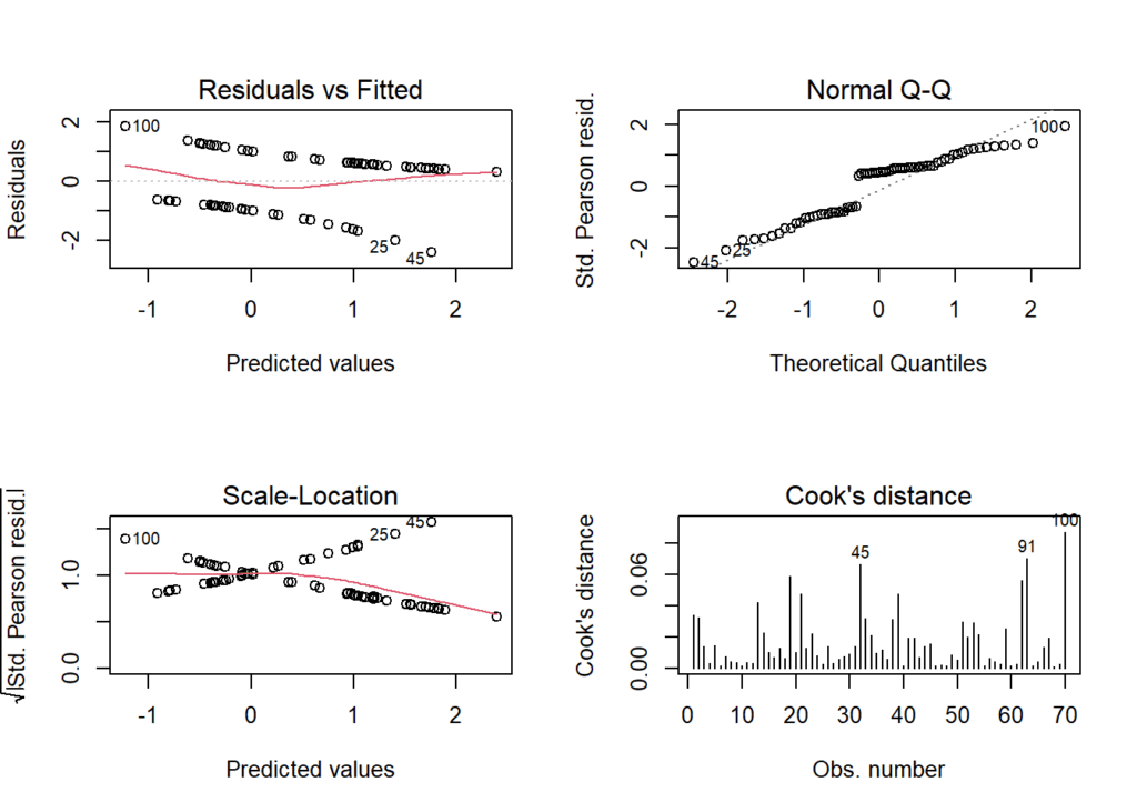
- The third plot is a plot of the residuals against the predicted values. Ideally, the residuals should be randomly scattered around zero, with no discernible pattern. In this case, the plot shows a slight pattern, with residuals being more negative at the lower end of predicted values and more positive at the higher end of predicted values, indicating some non-linearity in the model.
- The second plot is a Q-Q plot, which compares the distribution of the residuals to a normal distribution. Ideally, the residuals should fall along a straight line, indicating that they are normally distributed. In this case, the Q-Q plot shows some deviation from a straight line at the tails, indicating that the residuals are not quite normally distributed.
- The fourth plot is a scale-location plot, which shows the square root of the absolute residuals against the predicted values. Ideally, the plot should show no pattern, indicating that the residuals have constant variance (homoscedasticity). In this case, the plot shows a slight pattern, with the residuals having higher variance at the lower end of predicted values and lower variance at the higher end of predicted values, indicating some heteroscedasticity in the model.
- The first plot is a histogram of the residuals, which should ideally be normally distributed with mean zero. In this case, the histogram shows a roughly symmetric distribution of residuals around zero, indicating that the model is fitting the data well in terms of the overall distribution of residuals.
Conclusion
The results show that only the coefficient estimates for the intercept and x2 are statistically significant at the alpha level of 0.05. The Deviance Residuals are used to measure the difference between the predicted and observed values of the outcome variable, and they range from -1.9596 to 1.7228. The Residual deviance is used to measure the difference between the fitted model and the null model, and the lower the Residual deviance, the better the model fits the data. The AIC value is used to calculate the model’s goodness of fit, which is measured by a lower AIC value indicating a better model fit. The AIC value in this model is relatively low, suggesting that the model is a good fit for the data.
The report then uses the logistic regression model built on the training set to predict the outcome variable on the testing set. The predicted probabilities are compared to a threshold of 0.5 to determine the predicted class, which is either “yes” or “no.” The results show the predicted classes for a logistic regression model on a testing set. Finally, the accuracy of the logistic regression model on the testing set was evaluated. The accuracy is measured by the percentage of correct predictions made by the model.
Download R program — Click_here
Download R studio — Click_here

always i used to read smaller articles that also clear their motive, and
that is also happening with this article which I am reading here.