Linear regression analysis is one of the most widely used statistical techniques in the field of data analysis. It is a method that allows us to model the relationship between a dependent variable and one or more independent variables. In multiple linear regression, we use multiple independent variables to model the relationship with the dependent variable.
R is one of the most popular programming languages for data analysis and statistical computing. In this blog post, we will explore how to perform multiple linear regression analysis in R.
Contents
Loading the Data
To begin, first we have to load the data into R. In this example, we shall use the mtcars dataset, which is a built-in dataset in R. The mtcars dataset is a built-in dataset in R that contains information on various characteristics of 32 different automobile models released in the 1970s. The dataset is often used for teaching and learning purposes, as well as for demonstrating various data analysis techniques in R.
The mtcars dataset consists of 11 variables and 32 observations, with each row representing a different car model and each column representing a different characteristic of the car. The variables included in the dataset are:
- mpg: miles per gallon
- cyl: number of cylinders
- disp: engine displacement in cubic inches
- hp: horsepower
- drat: rear axle ratio
- wt: weight in thousands of pounds
- qsec: quarter mile time in seconds
- vs: engine type (0 = V-shaped, 1 = straight)
- am: transmission type (0 = automatic, 1 = manual)
- gear: number of forward gears
- carb: number of carburetors
# Load the data
data(mtcars)
head(mtcars)
# mpg cyl disp hp drat wt qsec vs am gear carb # Mazda RX4 21.0 6 160 110 3.90 2.620 16.46 0 1 4 4 # Mazda RX4 Wag 21.0 6 160 110 3.90 2.875 17.02 0 1 4 4 # Datsun 710 22.8 4 108 93 3.85 2.320 18.61 1 1 4 1 # Hornet 4 Drive 21.4 6 258 110 3.08 3.215 19.44 1 0 3 1 # Hornet Sportabout 18.7 8 360 175 3.15 3.440 17.02 0 0 3 2 # Valiant 18.1 6 225 105 2.76 3.460 20.22 1 0 3 1
Exploring the Data
Before we begin building our model, let’s first explore the data to understand the relationship between the variables. We can use the summary() function to get a summary of the data, including the mean, median, minimum, and maximum values for each variable.
# Get a summary of the data
summary(mtcars)
# mpg cyl disp hp # Min. :10.40 Min. :4.000 Min. : 71.1 Min. : 52.0 # 1st Qu.:15.43 1st Qu.:4.000 1st Qu.:120.8 1st Qu.: 96.5 # Median :19.20 Median :6.000 Median :196.3 Median :123.0 # Mean :20.09 Mean :6.188 Mean :230.7 Mean :146.7 # 3rd Qu.:22.80 3rd Qu.:8.000 3rd Qu.:326.0 3rd Qu.:180.0 # Max. :33.90 Max. :8.000 Max. :472.0 Max. :335.0 # drat wt qsec vs # Min. :2.760 Min. :1.513 Min. :14.50 Min. :0.0000 # 1st Qu.:3.080 1st Qu.:2.581 1st Qu.:16.89 1st Qu.:0.0000 # Median :3.695 Median :3.325 Median :17.71 Median :0.0000 # Mean :3.597 Mean :3.217 Mean :17.85 Mean :0.4375 # 3rd Qu.:3.920 3rd Qu.:3.610 3rd Qu.:18.90 3rd Qu.:1.0000 # Max. :4.930 Max. :5.424 Max. :22.90 Max. :1.0000 # am gear carb # Min. :0.0000 Min. :3.000 Min. :1.000 # 1st Qu.:0.0000 1st Qu.:3.000 1st Qu.:2.000 # Median :0.0000 Median :4.000 Median :2.000 # Mean :0.4062 Mean :3.688 Mean :2.812 # 3rd Qu.:1.0000 3rd Qu.:4.000 3rd Qu.:4.000 # Max. :1.0000 Max. :5.000 Max. :8.000
Creating scatter plot
We can also create scatterplots to visualize the relationship between the variables. For example, let’s create a scatterplot of the horsepower and miles per gallon variables:
# Create a scatterplot of horsepower and miles per gallon
library(ggplot2)
ggplot(data = mtcars, aes(x = hp, y = mpg)) +
          geom_point(shape = 21, fill = '#0f993d',
                     color = 'white', size = 4) +
theme_bw() 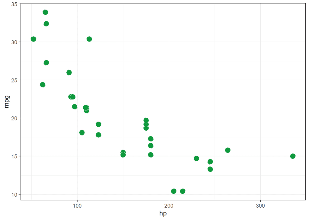
The resulting plot shows a negative relationship between horsepower and miles per gallon, which means that cars with higher horsepower tend to have lower miles per gallon.
Scatterplot matrix
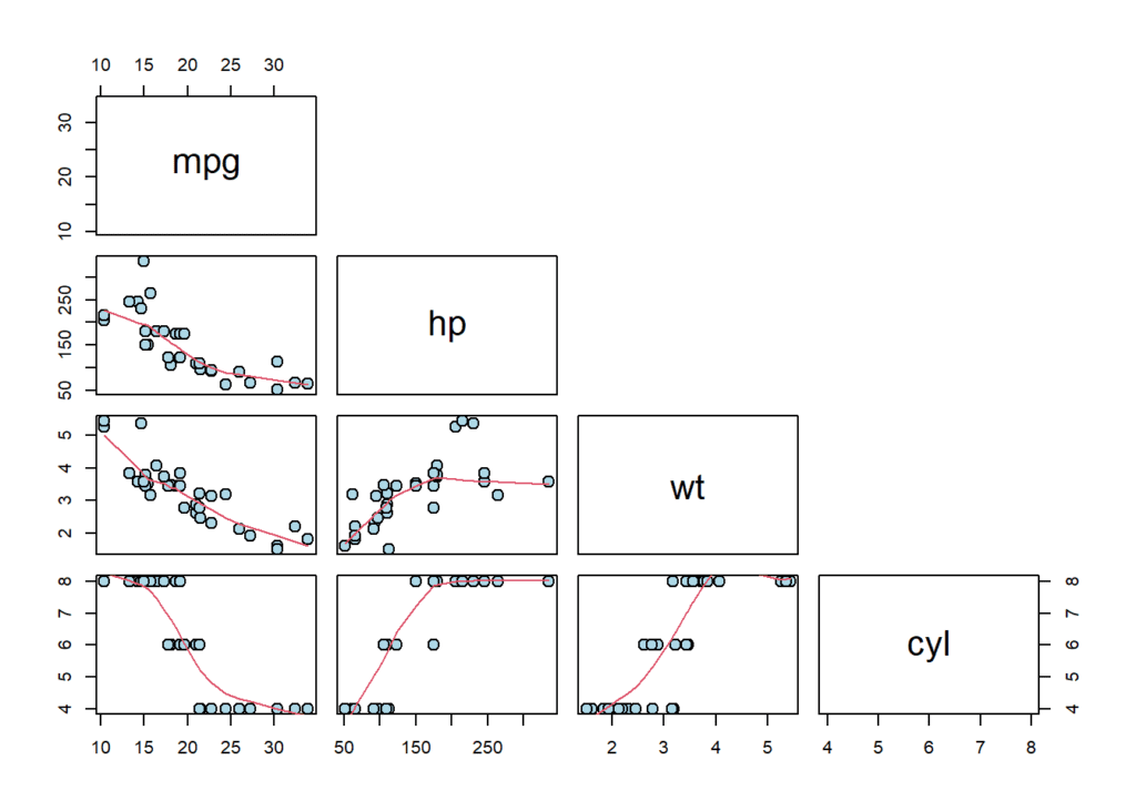
A scatterplot matrix can be used to visualize the relationships between the independent variables and the dependent variable. This can be created using the pairs() function in R.
pairs(
          mtcars[,c("mpg", "hp", "wt", "cyl")],
          upper.panel = NULL,
          lower.panel = panel.smooth,
          cex = 1.5, pch = 21, bg = "lightblue"
)
Building the Model
In multiple linear regression analysis in R, the goal is to model the relationship between a dependent variable and multiple independent variables. The lm() function is used to build the model and the summary() function is used to obtain important information about the model, such as the coefficients for each variable, the standard errors, and the p-values.
The p-value is used to determine the significance of the relationship between the dependent variable and each independent variable. A p-value less than 0.05 is typically considered statistically significant. Additionally, we can use the predict() function to make predictions based on the model.
In this model, we are using the mpg variable as the dependent variable and the hp, wt, and cyl variables as the independent variables. The data parameter specifies the dataset we are using.
# Build the linear regression model
model <- lm(mpg ~ hp + wt + cyl, data = mtcars)
model
# # Call: # lm(formula = mpg ~ hp + wt + cyl, data = mtcars) # # Coefficients: # (Intercept) hp wt cyl # 38.75179 -0.01804 -3.16697 -0.94162
The summary() function in R is used to obtain the output from a regression model. Specifically, when applied to a model object created by the lm() function, it provides a comprehensive summary of the model’s performance and the relationship between the dependent variable and independent variables.
# Get a summary of the model
summary(model)
# # Call: # lm(formula = mpg ~ hp + wt + cyl, data = mtcars) # # Residuals: # Min 1Q Median 3Q Max # -3.9290 -1.5598 -0.5311 1.1850 5.8986 # # Coefficients: # Estimate Std. Error t value Pr(>|t|) # (Intercept) 38.75179 1.78686 21.687 < 2e-16 *** # hp -0.01804 0.01188 -1.519 0.140015 # wt -3.16697 0.74058 -4.276 0.000199 *** # cyl -0.94162 0.55092 -1.709 0.098480 . # --- # Signif. codes: 0 '***' 0.001 '**' 0.01 '*' 0.05 '.' 0.1 ' ' 1 # # Residual standard error: 2.512 on 28 degrees of freedom # Multiple R-squared: 0.8431, Adjusted R-squared: 0.8263 # F-statistic: 50.17 on 3 and 28 DF, p-value: 2.184e-11
Interpretation of the model summary
The output of the summary() function includes several important pieces of information:
- The first section provides an overview of the model, including the formula used to create it and the number of observations used to fit it.
- The second section provides information about each independent variable in the model, including the estimated coefficient, the standard error, the t-value, and the associated p-value.
Coefficients: table shows the estimated coefficients (or slopes) for each of the predictor variables in your model. In this example, the coefficients for wt, hp, and cyl are all negative, which means that as these variables increase, the predicted value of mpg decreases. The Intercept coefficient is the predicted value of mpg when all predictor variables are 0.
t value and Pr(>|t|): These columns show the t-statistic and p-value for each coefficient estimate. The t-statistic measures how many standard errors the estimated coefficient is away from 0. The p-value tells you the probability of getting a t-statistic as extreme as the one you observed, assuming the null hypothesis that the true coefficient is 0. In this example, the p-values for predictor variable wt is less than 0.05, which means wt is statistically significant predictor of mpg.
- The third section provides information about the overall performance of the model:
Residual standard error: This is the standard deviation of the residuals (the differences between the observed values of mpg and the predicted values from the model). It gives you a measure of the amount of variability in the data that is not explained by the model.
R-squared: This is a measure of the proportion of variance in the response variable (mpg) that is explained by the predictor variables (wt, hp, and cyl) in the model. In this example, the R-squared value is 0.8431, which means that the predictor variables explain 84.31% of the variance in mpg.
F-statistic and Pr(>F): These show the overall significance of the model. The F-statistic is a measure of how much better the model fits the data than a model with no predictor variables. The p-value tells you the probability of getting an F-statistic as extreme as the one you observed, assuming the null hypothesis that the true coefficients are all 0. In this example, the p-value is less than 0.05, which means the model is statistically significant.
Making Predictions
The predict() function in R is used to make predictions based on a model. It takes two parameters: the first is the model object, and the second is a data frame containing the values for the independent variables for which we want to make predictions.
When using predict(), it is important to ensure that the independent variable names in the new data frame match those used in the original model. This is because the predict() function uses the coefficients from the model to calculate the predicted values for the dependent variable.
It is important to note that the accuracy of the predictions will depend on the quality of the original model and the new data used for prediction. Therefore, it is essential to use appropriate data cleaning and preprocessing techniques to ensure that the model is accurate and reliable for making predictions.
In this example, we are making a prediction based on a car with 140 horsepower, a weight of 4.5, and 7 cylinders. The data.frame() function is used to create a new data frame with these values. The predict() function takes the model and the new data as parameters and returns a prediction based on the model. In this example, the predicted miles per gallon for the car is approximately 15.
# Make a prediction
new_data <- data.frame(hp = 140, wt = 4.5, cyl = 7)
prediction <- predict(model, new_data)
prediction
# 1 # 15.38376
Visualizing model results
Partial regression plot
Partial regression plots can be used to visualize the relationship between a particular independent variable and the dependent variable, while controlling for the effects of the other independent variables. This can be created using the car::avPlot() function in R.
library(car)
par(mfrow = c(1, 3))
avPlot(model, variable = "hp")
avPlot(model, variable = "wt")
avPlot(model, variable = "cyl")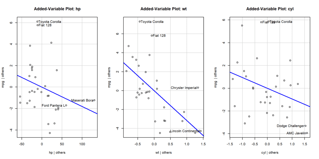
Effects plot
The effect_plot() is a function in R that is used to create a plot of the estimated marginal effects of an independent variable on the dependent variable in a regression model. The function is part of the jtools package in R.
The estimated marginal effect is the expected change in the dependent variable when the independent variable is changed by one unit, holding all other independent variables constant. The effect_plot() function plots these estimated marginal effects as a line or curve, with shaded areas representing the associated 95% confidence intervals.
library(jtools)
P1 <- effect_plot(model = model,
                  pred = "wt",
                  interval = TRUE,
                  plot.points = TRUE,
                  point.size = 3,
                  int.type = "confidence") + theme_bw()

P2 <- effect_plot(model = model,
                  pred = "hp",
                  interval = TRUE,
                  plot.points = TRUE,
                  point.size = 3,
                  int.type = "confidence") + theme_bw()

P3 <- effect_plot(model = model,
                  pred = "cyl",
                  interval = TRUE,
                  plot.points = TRUE,
                  point.size = 3,
                  int.type = "confidence") + theme_bw()

library(ggpubr)
ggarrange(P1,P2,P3, ncol = 3, align = "h")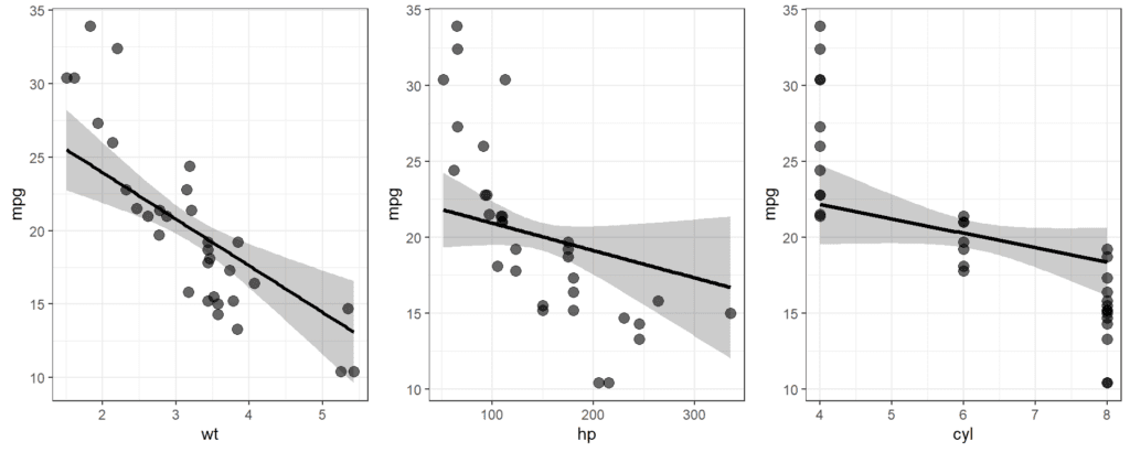
Fitted vs. actual values plot
This plot can be used to visualize the fit of the model by plotting the predicted values against the actual values of the dependent variable. This can be created using the plot() function in R with the arguments fitted(model) and residuals(model).
fitted <- predict(model)
actual <- mtcars$mpg

plot(fitted, actual,
     xlab = "Actual Values", ylab = "Fitted Values",
     main = "Fitted vs Actual Values Plot"
     )
abline(0,1,  col = "cornflowerblue", lwd = 2)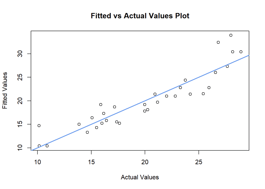
Conclusion
R provides a powerful set of tools for performing multiple linear regression analysis. By loading and exploring the data, building the model using the lm() function, and making predictions using the predict() function, we can gain valuable insights into the relationship between variables and make predictions based on new data. The results of the model can be visualized in different ways. Multiple linear regression is a widely used statistical technique, and being able to perform it in R is a valuable skill for any data analyst or scientist.
Download R program — Click_here
Download R studio — Click_here

