Principal component analysis (PCA) is a multivariate statistical technique used to identify patterns in high-dimensional data by reducing the number of variables while retaining most of the original information. In other words, PCA is a method of transforming a large number of possibly correlated variables into a smaller number of uncorrelated variables called principal components.
The importance of PCA lies in its ability to simplify complex datasets, reduce noise, and enhance the interpretability of data. It is widely used in various fields, such as finance, biology, marketing, and engineering, to extract meaningful insights from large and complex datasets. PCA can help in identifying key factors that drive the variability in the data, uncovering hidden relationships among variables, and improving the accuracy of predictive models. Additionally, PCA is a valuable tool for data visualization, as it enables the visualization of high-dimensional data in 2D or 3D space, making it easier to identify patterns and trends.
Principal component analysis (PCA) works by transforming a set of correlated variables into a set of uncorrelated variables, called principal components (PCs). The first PC accounts for the largest amount of variance in the original data, followed by the second PC, which accounts for the next largest amount of variance, and so on. The goal of PCA is to identify the minimum number of PCs that can explain the maximum amount of variance in the data.
The process of PCA involves the following steps:
- Data standardization: The first step in PCA is to standardize the data to have zero mean and unit variance. This is important because PCA is sensitive to the scale of the data.
- Eigenvalue decomposition: The covariance matrix of the standardized data is calculated, and then the eigenvectors and eigenvalues of this matrix are computed. The eigenvectors represent the directions of the maximum variance in the data, while the corresponding eigenvalues indicate the amount of variance explained by each eigenvector.
- Selection of principal components: The eigenvectors are ranked in order of their corresponding eigenvalues, with the eigenvector associated with the largest eigenvalue being the first principal component. Subsequent principal components are chosen in the same way, subject to the constraint that they must be orthogonal to all previous components.
- Projection of data: The original data is projected onto the principal components, producing a new set of uncorrelated variables. The resulting scores represent the coordinates of each data point in the principal component space.
By analyzing the principal components and their corresponding scores, one can identify the underlying patterns and relationships in the data, as well as the variables that are most important in explaining the variability.
Contents
Data Preparation
The below code generates four sets of random numbers and assigns them to x1, x2, x3, and x4. Then, it creates a variable y based on x1. Next, it creates a data frame called data containing x1, x2, x3, x4, and y. It also creates a subset of data called X containing only the first four columns of data. Finally, it displays the first few rows of data.
set.seed(123)
x1 <- rnorm(100, mean = 10, sd = 2)
x2 <- rnorm(100, mean = 20, sd = 4)
x3 <- rnorm(100, mean = 30, sd = 6)
x4 <- rnorm(100, mean = 40, sd = 8)

# Create labels based on x1
y <- ifelse(x1 < 10, "Low", ifelse(x1 < 15, "Medium", "High"))

data <- data.frame(x1, x2, x3, x4, y)

X <- data[c(1:4)]
y <- data$y
head(data)
# x1 x2 x3 x4 y # 1 8.879049 17.15837 43.19286 34.27806 Low # 2 9.539645 21.02753 37.87448 33.97849 Low # 3 13.117417 19.01323 28.40913 32.49169 Medium # 4 10.141017 18.60983 33.25916 31.57989 Medium # 5 10.258575 16.19353 27.51396 36.50272 Medium # 6 13.430130 19.81989 27.14252 42.64943 Medium
Exploratory data analysis
Descriptive statistics
The summary() function is a built-in R function that returns a statistical summary of the data passed to it. The output of this function provides a quick overview of the data’s central tendency, dispersion, and distribution.
# Perform EDA
summary(data)
# x1 x2 x3 x4 # Min. : 5.382 Min. :11.79 Min. :19.46 Min. :20.27 # 1st Qu.: 9.012 1st Qu.:16.80 1st Qu.:26.81 1st Qu.:34.16 # Median :10.124 Median :19.10 Median :30.22 Median :39.97 # Mean :10.181 Mean :19.57 Mean :30.72 Mean :39.71 # 3rd Qu.:11.384 3rd Qu.:21.87 3rd Qu.:34.58 3rd Qu.:45.51 # Max. :14.375 Max. :32.96 Max. :43.76 Max. :60.57 # y # Length:100 # Class :character # Mode :character # # #
The results of the summary() function indicate that the data contains four numeric variables, x1, x2, x3, and x4, and one character variable y.
For the numeric variables, we can see that the range of values varies across each variable, with minimum values ranging from 5.382 to 20.27 and maximum values ranging from 14.375 to 60.57. The median values for the numeric variables range from 10.124 to 39.97, indicating that the data is somewhat skewed towards the upper end of the range.
The quartiles provided for each variable indicate the spread of the data and the interquartile range. For example, the 1st quartile for x1 is 9.012, which means that 25% of the data is below this value, and the 3rd quartile is 11.384, which means that 75% of the data is below this value.
For the character variable y, the summary function reports that it has a length of 100, a class of “character,” and a mode of “character”. This suggests that y likely contains categorical data in string format.
Correlation matrix
The cor() function is a built-in R function that calculates the correlation between variables in a data matrix. The [-5] indexing operator is used to exclude the fifth variable, likely because it is a non-numeric variable (e.g., categorical or text data) and therefore cannot be included in the correlation calculation.
cor(data[-5])# x1 x2 x3 x4 # x1 1.00000000 -0.04953215 -0.12917601 -0.04407900 # x2 -0.04953215 1.00000000 0.03057903 0.04383271 # x3 -0.12917601 0.03057903 1.00000000 -0.04486571 # x4 -0.04407900 0.04383271 -0.04486571 1.00000000
The diagonal entries of the matrix are all equal to 1.0, which is expected since each variable is perfectly correlated with itself.
Looking at the off-diagonal entries, we can see that x1 is negatively correlated with x2, x3, and x4, with correlation coefficients of -0.04953215, -0.12917601, and -0.04407900, respectively. In contrast, x2 has a positive correlation with x3 and x4, with correlation coefficients of 0.03057903 and 0.04383271, respectively.
The correlation coefficient between x1 and x3 is negative but relatively weak (-0.12917601), while the coefficient between x1 and x4 is also negative but weaker still (-0.04407900).
These results suggest that there is little correlation between the variables in the dataset, with only a few weak correlations between certain pairs of variables.
Correlation plot
The cor() function is used to calculate the correlation matrix between the variables, and the resulting matrix is passed as the first argument to corrplot(). The method = “circle” argument specifies that the circular layout should be used for the plot.
library(corrplot)
corrplot(cor(data[-5]), method = "circle")
The resulting plot shows the correlation coefficients between each pair of variables as colored segments around a circle. The strength of the correlation is indicated by the intensity of the color.
Visualizing variables
The below code is used to create two scatter plots of the variables in a dataset called data, using the ggplot2 package in R. The first scatter plot shows the relationship between x1 and x2, while the second scatter plot shows the relationship between x3 and x4. The resulting plots are then arranged side-by-side using the ggarrange() function from the ggpubr package.
library(ggplot2)
library(ggpubr)
# Plot the data
p1 <- ggplot(data, aes(x = x1, y = x2)) +
          geom_point() +
          xlab("X1") +
          ylab("X2") +
          ggtitle("Scatter Plot of X1 and X2") +
          theme_bw()

p2 <- ggplot(data, aes(x = x3, y = x4)) +
          geom_point() +
          xlab("X3") +
          ylab("X4") +
          ggtitle("Scatter Plot of X3 and X4") +
          theme_bw()

ggarrange(p1, p2, ncol = 2, nrow = 1)
Each point in the plot represents a sample in the dataset. The plot shows that there is a weak negative correlation between x1 and x2, as the points are scattered around the plot with no clear pattern or trend. Similarly, there is no clear correlation between x3 and x4, as the points are scattered around the plot with no clear pattern or trend.
Data scaling
The given code is scaling the dataset data using the scale function, which scales the data by centering it to have mean zero and scaling it to have a standard deviation of one. The result is stored in a new variable called scaled_data.
# Scale the data
scaled_data <- scale(data[-5])
To verify that the scaling was successful, the code then uses the colMeans function to check the mean of each column of the scaled_data. Since the data has been centered, the mean of each column should be close to zero, but may not be exactly zero due to rounding errors. Since the data has been scaled, the mean of each column is approximately zero.
# Check the mean of the scaled data
colMeans(scaled_data)
# x1 x2 x3 x4 # -2.366510e-16 -1.882695e-16 -1.876407e-16 -1.208885e-16
The apply function is then used to calculate the standard deviation of each column of scaled_data. The second argument 2 in the apply function tells it to apply the sd function to each column. Since the data has been scaled, the standard deviation of each column should be close to one, but again may not be exactly one due to rounding errors. Since the data has been scaled, the standard deviation of each column is equal to 1.
# Check deviation of the scaled data
apply(scaled_data, 2, sd)
# x1 x2 x3 x4 # 1 1 1 1
Performing PCA in R
The below code performs Principal Component Analysis (PCA) on the training data using the prcomp() function. PCA is a technique used to reduce the dimensionality of a large dataset by finding new uncorrelated variables, called principal components, that explain the most variance in the data. The summary() function is used to summarize the PCA results, which includes the proportion of variance explained by each principal component, the cumulative proportion of variance explained, and the loadings of each variable on each principal component.
# Run PCA on the training data
pca <- prcomp(scaled_data)

# Summarize the PCA results
summary(pca)
# Importance of components: # PC1 PC2 PC3 PC4 # Standard deviation 1.0736 1.0243 0.9762 0.9193 # Proportion of Variance 0.2882 0.2623 0.2382 0.2113 # Cumulative Proportion 0.2882 0.5505 0.7887 1.0000
Interpreting the results
These results show the summary of the principal component analysis (PCA) of the dataset. The table provides information about the importance of each principal component (PC). The first row shows the standard deviation of each principal component. The second row shows the proportion of variance explained by each principal component. The third row shows the cumulative proportion of variance explained up to that principal component.
For example, in this output, PC1 has a standard deviation of 1.0736 and explains 28.82% of the variance in the data. PC1 and PC2 combined explain 55.05% of the variance in the data, and all four components together explain 100% of the variance. This information can be used to decide how many principal components to retain for further analysis.
Creating new data containing first two PCs
The below code creates a new data frame X_pca containing the first two principal components from the PCA analysis. The pca$x contains the projected data onto the principal components obtained from the PCA analysis. The [, 1:2] subset only the first two principal components. The function as.data.frame() is used to convert the resulting matrix into a data frame. The resulting data frame X_pca can be used for data visualization or further analysis.
X_pca <- as.data.frame(pca$x[, 1:2])Splitting data into training and testing sets
The code below loads the caret package and uses its createDataPartition() function to split the data into training and test sets. The function randomly selects 80% of the data to be used for training and the remaining 20% for testing. The input variables X_pca and y contain the predictor variables and the response variable, respectively. The resulting variables X_train, y_train, X_test, and y_test contain the training and testing sets of the predictor variables and response variable, respectively. The set.seed() function sets the random seed to a fixed value of 42, ensuring that the results can be reproduced.
library(caret)
# Split data into train and test sets
set.seed(42)
train_index <- createDataPartition(y, times = 1, p = 0.8, list = FALSE)
X_train <- X_pca[train_index, ]
y_train <- y[train_index]
X_test <- X_pca[-train_index, ]
y_test <- y[-train_index]
Training logistic regression model
The below code trains a logistic regression model using the train() function from the caret package. The training data consists of the predictors X_train and the response variable y_train. The logistic regression model is specified using the method parameter with a value of “glm” (for Generalized Linear Model) and the family parameter with a value of “binomial” (for logistic regression). The resulting model object is stored in the clf variable.
The summary() function is then used to print a summary of the trained model, which includes information on the coefficients, standard errors, and statistical significance of each predictor variable. It also displays the goodness-of-fit statistics such as the null deviance, residual deviance, and AIC (Akaike Information Criterion) values.
library(caret)
# Train logistic regression model
clf <- train(x = X_train, y = y_train, method = "glm", family = "binomial")
summary(clf)
# # Call: # NULL # # Deviance Residuals: # Min 1Q Median 3Q Max # -1.8632 -0.6577 0.1614 0.7911 2.4577 # # Coefficients: # Estimate Std. Error z value Pr(>|z|) # (Intercept) 0.1299 0.2843 0.457 0.648 # PC1 1.8106 0.4153 4.359 1.3e-05 *** # PC2 -0.1062 0.2870 -0.370 0.711 # --- # Signif. codes: 0 '***' 0.001 '**' 0.01 '*' 0.05 '.' 0.1 ' ' 1 # # (Dispersion parameter for binomial family taken to be 1) # # Null deviance: 112.179 on 80 degrees of freedom # Residual deviance: 75.526 on 78 degrees of freedom # AIC: 81.526 # # Number of Fisher Scoring iterations: 5
The output shows the results of a logistic regression model with two principal components as predictors. The deviance residuals indicate that the model fits the data well, with a relatively small range of residuals.
The coefficients table shows the estimated coefficients for each predictor variable, their standard errors, and the corresponding p-values. The Intercept has an estimated coefficient of 0.1299 and is not significant (p-value = 0.648), meaning it is not a significant predictor of the response variable. PC1 and PC2 have estimated coefficients of 1.8106 and -0.1062, respectively. PC1 is statistically significant (p-value < 0.001), indicating that it is a significant predictor of the response variable. PC2, on the other hand, is not significant (p-value = 0.711).
The null deviance represents the deviance of a model with only the intercept as a predictor, while the residual deviance represents the deviance of the fitted model. The AIC (Akaike Information Criterion) is a measure of model quality that accounts for both goodness of fit and model complexity, with lower values indicating better models. The Fisher Scoring iterations indicate the number of iterations required for the model to converge.
Making predictions
The below code is used to project the test data onto the principal components obtained from the training data using the predict() function. The predict() function is used to predict the outcome of new observations using a fitted model. Here, pca is the fitted PCA model object obtained from the training data, and newdata = test_data specifies the new data (test_data) to be projected onto the principal components. The resulting predictions object will contain the projected values of the test data onto the principal components.
# Predict on test set
y_pred <- predict(clf, X_test)

head(y_pred)
# [1] Medium Medium Low Low Medium Medium # Levels: Low Medium
Accuracy of the model
The below code calculates the accuracy of the model by comparing the predicted values (y_pred) with the actual values (y_test) using the confusionMatrix function from the caret package. The function returns various evaluation metrics including overall accuracy, which is extracted using “$overall["Accuracy"]”. Finally, the accuracy is printed on the console using the print function.
# Calculate accuracy
accuracy <- confusionMatrix(as.factor(y_pred),
                            as.factor(y_test))$overall["Accuracy"]
print(paste("Accuracy:", round(accuracy*100, 2), "%"))
# [1] "Accuracy: 78.95 %"
The output “Accuracy: 78.95 %” means that the accuracy of the model in predicting the target variable on the test set is 78.95%. In other words, 78.95% of the observations in the test set were correctly classified by the model.
Visualizing PCA Results
Creating a scatter plot
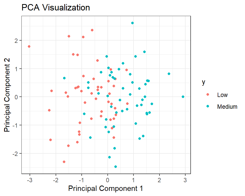
The below code creates a data frame ‘df’ with the first two principal components from the PCA analysis (stored in pca object) and the corresponding labels y. Then, it uses the ‘ggplot2’ library to create a scatter plot of the data points, where the x-axis represents the first principal component (PC1), the y-axis represents the second principal component (PC2), and the color of the points represents the class labels. The function ‘geom_point()’ adds points to the plot, and ‘labs()’ sets the title and axis labels. Finally, ‘theme_bw()’ sets the plot theme to a black and white style. This visualization helps to understand the relationship between the variables and the classes, as well as how much variance is explained by the principal components.
# create a data frame with the first two principal components
df <- data.frame(PC1 = pca$x[,1], PC2 = pca$x[,2], y = y)

# plot the data points colored by their class
ggplot(df, aes(x = PC1, y = PC2, color = y)) +
  geom_point() +
  labs(title = "PCA Visualization",
       x = "Principal Component 1",
       y = "Principal Component 2") +
          theme_bw()
Creating a biplot
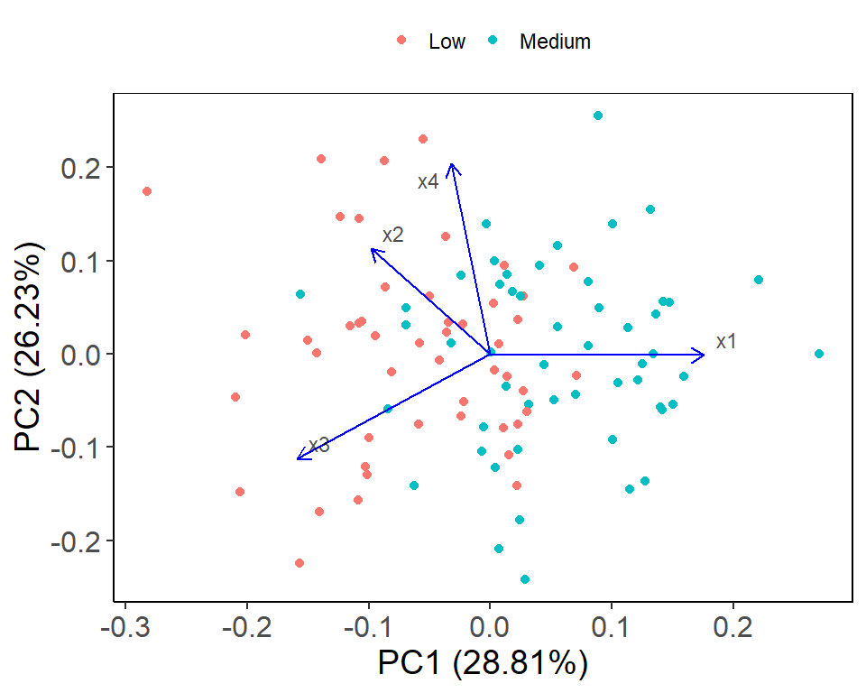
The below code is using the ggfortify package to create a biplot of the PCA results generated earlier. The autoplot function is used to create the biplot with various customizations such as color-coding the data points by class label (colour = "y"), displaying the loadings with arrows (loadings = TRUE) and customizing the appearance of the arrows and labels. The theme functions are used to customize the appearance of the plot, such as changing the font size and adding borders to the plot.
library(ggfortify)
# Create biplot using ggplot2 and ggfortify
autoplot(pca, data = data, colour = "y",
         loadings = TRUE, loadings.colour = "blue",
         loadings.label = TRUE, loadings.label.size = 3,
         loadings.label.color = "black", loadings.label.alpha = 0.7,
         loadings.label.repel = TRUE, loadings.label.nudge = 0.1,
         loadings.arrow = arrow(length = unit(0.03, "npc")),
         loadings.arrow.fill = "blue", loadings.arrow.alpha = 0.7,
         loadings.arrow.position = position_jitter(0.2)) +
          theme_classic() +
          theme(axis.line = element_line(size = 0.5,
                                         colour = "black"),
                panel.grid.major = element_blank(),
                panel.grid.minor = element_blank(),
                panel.border = element_rect(colour = "black",
                                            fill = NA,
                                            size = 0.5),
                plot.title = element_text(size = 16, hjust = 0.5),
                legend.position = "top", legend.key.size = unit(0.4, "cm"),
                legend.key.width = unit(0.4, "cm"),
                legend.title = element_blank(),
                axis.title.x = element_text(size = 14),
                axis.title.y = element_text(size = 14),
                axis.text.x = element_text(size = 12),
                axis.text.y = element_text(size = 12))
The biplot shows the relationship between the variables (x1, x2, x3, x4) and the observations (represented by colors based on the y variable). The first principal component (PC1) captures the majority of the variation in the data and is primarily driven by x4. The second principal component (PC2) is mostly influenced by x3 and x2. The direction and length of the arrows (loadings) indicate the strength and direction of the relationship between the variables and the principal components. For example, there is a strong positive relationship between x4 and PC1, and a strong negative relationship between x3 and PC2. The plot also shows the distance between the observations and the origin, indicating the level of influence each observation has on the principal components. Overall, the plot provides a useful visualization of the structure of the data and can aid in identifying patterns and relationships between variables.
Contribution plot
The code creates a contribution plot using the fviz_contrib() function from the factoextra package, which shows the contribution of variables to each principal component. The choice argument specifies that the contribution of variables to the variance of the principal components should be displayed, and the axes argument specifies which principal components to consider. The resulting plot is then visualized.
# Create a contribution plot
contrib_plot <- factoextra::fviz_contrib(pca, choice = "var", axes = 1:2)

# Visualize the contribution plot
contrib_plot
The contribution plot also displays the total contribution of each variable to all the principal components, which is shown on the right-hand side of the plot. It shows that x4 has the highest contribution to all the principal components, followed by x3, x2, and x1.
Variance plot
The below code uses the R package factoextra to create a variance plot for the PCA. The variance plot displays the amount of variance explained by each principal component (PC) of the dataset. The fviz_eig() function from the factoextra package is used to create the variance plot, with the pca object resulting from the PCA analysis as input. The addlabels parameter is set to TRUE to add labels to the plot, and the ylim parameter is used to set the y-axis limits of the plot. The resulting plot is assigned to the object var_plot and can be visualized using the var_plot variable.
library(factoextra)
# Create variance plot
var_plot <- fviz_eig(pca, addlabels = TRUE, ylim = c(0, 50))

# Visualize variance plot
var_plot
The variance plot shows the proportion of variance explained by each principal component (PC). The x-axis represents the PC number and the y-axis represents the proportion of variance explained. In this plot, the first PC explains the highest amount of variance, followed by the second, third, and fourth PCs. The plot also shows the cumulative proportion of variance explained, with the first PC explaining around 45% of the total variance, the second PC explaining around 30%, the third PC explaining around 20%, and the fourth PC explaining less than 5%. This indicates that the first two PCs are the most important in explaining the variability in the data, and the remaining PCs may have less influence on the overall variability.
Conclusion
Based on the analysis, we created a simulated dataset with four variables and used principal component analysis (PCA) to reduce its dimensionality and visualized the results. Then, we split the data into training and testing sets, trained a logistic regression model on the training set, and evaluated its accuracy on the testing set. The contribution plot and variance plot were used to understand the relative contribution of the variables and the proportion of variance explained by each principal component. Overall, the analysis shows how PCA can be used for dimensionality reduction and how logistic regression can be used for classification tasks. The accuracy of the logistic regression model on the test set was 78.95%.
One recommendation for improvement would be to use more informative variable names instead of x1, x2, x3, and x4, which can make the code easier to read and understand. Additionally, it may be helpful to add comments explaining the purpose of each step in the code. Finally, it may be useful to try other classification algorithms besides logistic regression and compare their performance on the test set.
Download R program — Click_here
Download R studio — Click_here


Great job
Thank you dear
I’m interested and I like this presentation
Thank you, Markos