A pie chart is a circular chart that is used to represent data in a visual format. The chart is divided into sectors or slices, with each slice representing a proportion of the whole. Pie charts are commonly used to represent categorical data, where the categories are mutually exclusive and the sum of all categories is 100%.
Each slice of the pie chart is proportional to the quantity it represents. The slices are often colored differently to make them easier to distinguish from one another, and labels can be added to indicate the category or the proportion it represents. Pie charts can be created using a variety of software tools, including spreadsheet programs, data visualization software, and programming languages such as R and Python. Here you will learn, how to create a pie chart in R using ggplot2 package.
Contents
Why choose a pie chart
Here are some reasons why one might choose a pie chart:
- Displaying proportions: Pie charts are effective for displaying relative proportions of different categories in a dataset. The size of each slice of the pie corresponds to the proportion of data it represents, making it easy for the viewer to understand the relative distribution of the categories.
- Ease of interpretation: Pie charts are easy to interpret, even for those who are not familiar with data visualization. The circular shape of the pie chart is intuitive, and the slices can be labeled with the category names and/or percentages to make the information even more accessible.
- Visual appeal: Pie charts are visually appealing, making them a great choice for presentations or reports where aesthetics are important. They can be customized with colors, labels, and other design elements to make them stand out and draw attention to the data.
- Simplifying complex data: Pie charts can simplify complex data by breaking it down into smaller, more manageable parts. This can make it easier to identify patterns or trends in the data.
- Comparing categories: Pie charts can be used to compare the relative proportions of different categories in a dataset. This can be useful for identifying which categories are the most significant or for comparing the same categories across different datasets.
While pie charts are a useful data visualization tool, it is important to note that they can have some limitations. For example, they may not be as effective for displaying large amounts of data, or for displaying categories with similar proportions. In addition, it is important to choose the right chart type for the data being presented and to ensure that the chart is accurate, clear, and easy to interpret.
Creating dataset
This R code creates a data frame called “data” with two columns, social_media and Impressions.
Here is a breakdown of each line:
We first set the seed using the set.seed() function to ensure that the results are reproducible. Then we created one column called “social_media”. The column is populated by repeating the values “Facebook”, “Instagram”, “Linkedin”, “Twitter”, and “Youtube” the number of times specified by the “times” parameter.
Then we created a new vector called “Impressions” with random numbers generated by the rnorm() function. The n argument specifies the number of random numbers to generate, the mean parameter specifies the mean of the normal distribution, and the sd parameter specifies the standard deviation of the normal distribution.
The resulting data frame has two columns and 2280 rows, with each row representing a social media platform and the corresponding number of Impressions. We shall use this data for to create pie chart in R using ggplot2 package.
set.seed(123)
data <- data.frame(
          social_media <- rep(c("Facebook", "Instagram", "Linkedin", "Twitter", "Youtube"),
                              times = c(510,240,750,430,350)),
          Impressions <- c(rnorm(n = 510, mean = 4535, sd = 100),
                           rnorm(n = 240, mean = 5599, sd = 120),
                           rnorm(n = 750, mean = 5102, sd = 105),
                           rnorm(n = 430, mean = 5238, sd = 110),
                           rnorm(n = 350, mean = 5090, sd = 100)
                           )
)

colnames(data) <- c("social_media", "impressions")
head(data)
# social_media impressions # 1 Facebook 4478.952 # 2 Facebook 4511.982 # 3 Facebook 4690.871 # 4 Facebook 4542.051 # 5 Facebook 4547.929 # 6 Facebook 4706.506
Calculating counts and percentages for each category
We used dplyr package in R to create a new data frame called percent_data that summarizes the percentage of impressions for each social media platform. we used is a pipe operator that passes data to the next operation in the chain by grouping the social_media variable. Then percentage of impressions for each group was calculted using the summarise() function. The round() function is used to round the percentage value to 1 decimal place. The percentage is calculated by dividing the sum of impressions for each social media platform by the total sum of impressions in the data frame, and then multiplying by 100.
library(dplyr)
# group the data by category and calculate the percentage of each value
percent_data <- data %>%
          group_by(social_media) %>%
          summarise(counts = n(),
                    percent = round((sum(impressions) / sum(data$impressions)) * 100,
                                          digits = 1))

# display the percentage data
percent_data
# # A tibble: 5 x 3 # social_media counts percent # <chr> <int> <dbl> # 1 Facebook 510 20.1 # 2 Instagram 240 11.7 # 3 Linkedin 750 33.2 # 4 Twitter 430 19.6 # 5 Youtube 350 15.4
Creating a pie chart based on counts of each category
The below code creates a polar bar plot of counts for each social media platform. It uses the ggplot() function with the data argument set to the data frame that contains the social media platform and their corresponding counts, and the mapping argument set to the aesthetic mappings for x and fill. The x aesthetic is set to “social_media”, and the fill aesthetic is also set to “social_media”. This means that each social media platform will be represented by a different color in the plot.
The geom_bar() function is used to add a bar layer to the plot, and the width argument is set to 1, which means the bars will be full width. The coord_polar() function is used to convert the plot from Cartesian to polar coordinates, with the theta argument set to “x”, which means that the x axis will be mapped to the polar angle.
The resulting chart will have bars arranged in a circular pattern, with each bar representing a social media platform and the height of the bar representing the number of Impressions. The fill color of each bar will be different based on the social media platform it represents.
library(ggplot2)
ggplot(data = data,
       mapping = aes(x = social_media,
                     fill = social_media)) +
          geom_bar(width = 1) +
          coord_polar(theta = "x")
We can create the same plot of counts by using percent_data object we created earlier using little modification in the above code. The difference in two codes is that the first code uses auto generated counts data to plot the bars, while the second code uses a data frame (percent_data) that includes the manually computed counts for each social media platform. The second code also uses the stat = "identity" argument in geom_bar() function to plot the heights of the bars based on the counts, while the first code uses the default stat = "count" argument to count the number of occurrences of each social media platform.
ggplot(data = percent_data,
       mapping = aes(x = social_media, y = counts,
                     fill = social_media)) +
          geom_bar(stat = "identity", width = 1) +
          coord_polar(theta = "x")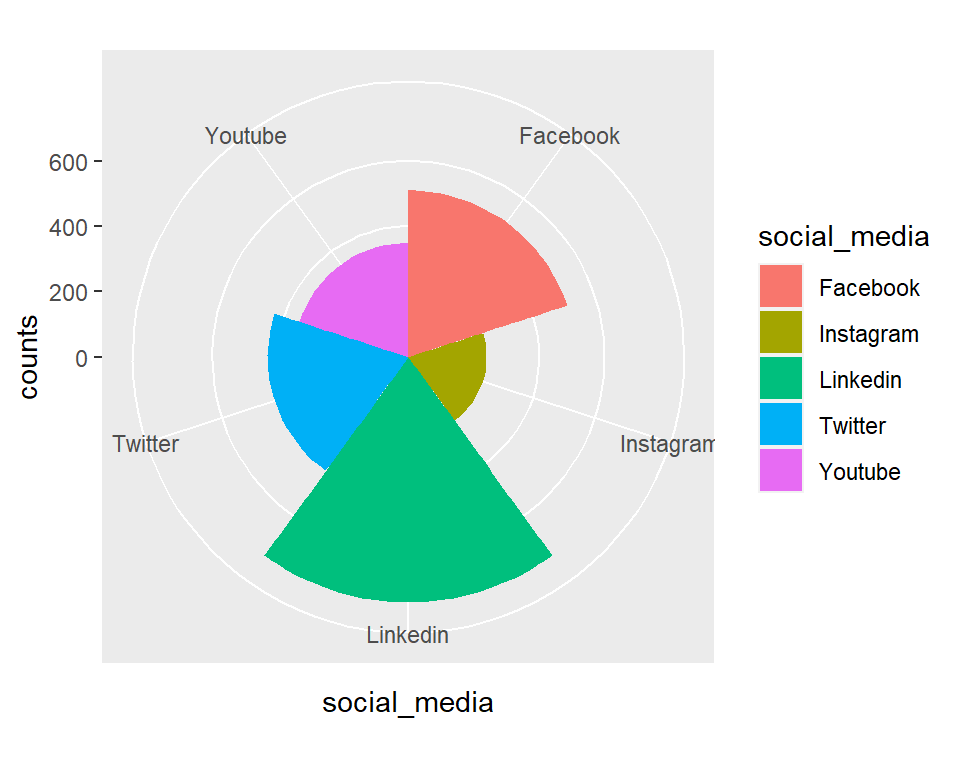
Customizing pie chart of counts
The following code uses the ggplot2 library in R to create a polar bar chart of the frequency distribution of social media platforms. We added the following layers to create this:
ggplot(): This creates a new ggplot object with the specified data by usingggplotfunction.geom_bar(mapping = aes()): This adds a bar chart layer to the plot, using the social_media variable for the x-axis and fill. The fill parameter specifies that each bar should be filled with a different color based on the social_media variable.coord_polar(): This sets the coordinate system of the plot to polar coordinates.scale_fill_brewer(): This sets the color palette of the bars to a color brewer palette called Set2.labs(): This sets the title, subtitle, x-axis label, and y-axis label of the plot.theme(): This sets the spacing between the panels to 5 lines.theme_minimal(): This sets the theme of the plot to a minimal theme.theme(legend.position = "none"): This layer removes the legend from the plot.theme(text=element_text(family="Georgia", size=11)): This sets the font family and size for the plot text to Georgia and 11, respectively.
ggplot(data = percent_data, mapping = aes(x = social_media, fill = social_media, y = percent)) +
          geom_bar(stat = "identity") +
          coord_polar() +
          scale_fill_brewer(palette="Set2") +
          labs(title="Distribution of Social Media Platforms",
               subtitle="Self created data",
               x = "Social media",
               y = "Frequency") +
          theme(panel.spacing = unit(5, "lines")) +
          theme_minimal()+
          theme(legend.position="none") +
theme(text=element_text(family="Georgia", size=11)) 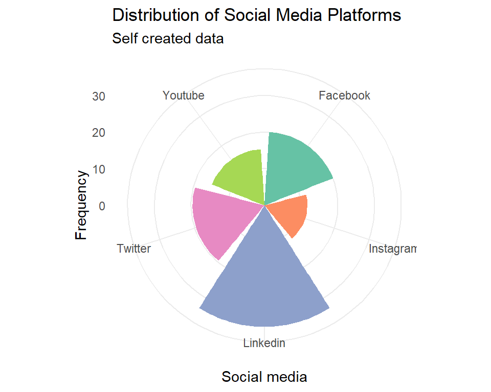
Creating pie chart of percentage
In the below we have created a simple pie chart using ggplot() function from ggplot2 package. The data being plotted is stored in the object “percent_data”. The mapping argument in the ggplot function is used to define how the variables in the data should be mapped to the aesthetics of the plot. In this case, the “x” aesthetic is set to an empty string, which means that no x-axis labels will be displayed. The “y” aesthetic is set to the “percent” column of the data, and the “fill” aesthetic is set to the “social_media” column of the data.
Next we added the geom_bar() function layer to create a bar chart. The “width” argument sets the width of the bars to 1, and the “stat” argument is set to “identity”, which means that the heights of the bars should be taken directly from the data. Next, the scale_y_continuous() function is used to set the breaks on the y-axis. The “round” function is used to round the cumulative sum of the percentages in the data, and the “rev” function is used to reverse the order of the percentages before taking their cumulative sum. This ensures that the breaks are evenly spaced across the y-axis.
Finally, the coord_polar() function is used to convert the bar chart into a polar bar chart. The theta argument is set to “y”, which means that the height of each bar corresponds to the angle at which it is plotted. The start argument is set to 0, which means that the first bar will be plotted at the top of the chart.
ggplot(data = percent_data,
       mapping = aes(x = "",
                     y = percent,
                     fill = social_media)) +
          geom_bar(width = 1,
                   stat = "identity") +
          scale_y_continuous(breaks = round(cumsum(rev(percent_data$percent)), 1)) +
          coord_polar(theta = "y",
                      start = 0)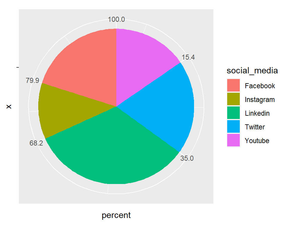
Customizing pie chart
Next, we added few more functions to make this pie chart more attractive:
geom_text(): This adds the text layer to the plot, with theposition_fill(vjust = 0.5)argument used to position the text in the middle of each bar. The text color is set to white to contrast with the colored bars, and the size is set to 5.scale_fill_brewer(): This sets the color palette for the fill aesthetic to the Set2 palette from the RColorBrewer package.theme_void(): This removes all non-data elements from the plot, including the axis labels and tick marks.theme(legend.position = "right"): This sets the position of the legend to the right side of the plot.
ggplot(percent_data,
       aes(x = "",
           y = percent,
           fill = social_media,
           label = paste0(percent, "%"))) +
          geom_bar(stat = "identity",
                   width = 1,
                   color = "white",
                   position = "fill") +
          coord_polar(theta = "y",
                      start = 0,
                      direction = -1) +
          geom_text(position = position_fill(vjust = 0.5),
                    color = "white",
                    size = 5) +
          scale_fill_brewer(palette = "Set2") +
          theme_void() +
          theme(legend.position = "right")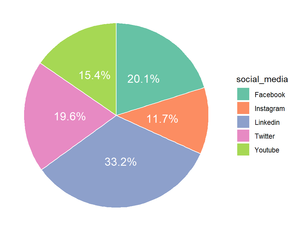
Download R program — Click_here
Download R studio — Click_here

