In today’s digital age, data is more abundant than ever before. For businesses and researchers alike, making sense of this data is crucial. Time series analysis is a powerful tool in this endeavor, allowing us to extract meaningful insights from temporal data. In this comprehensive guide, we will delve into the world of time series analysis using R, a versatile and widely-used programming language. We will leverage R’s built-in datasets and provide detailed R code for each step of the analysis, complete with visualizations.
Contents
What is Time Series Analysis?
Before we dive into the technical aspects, let’s clarify what time series analysis is and why it’s essential. Time series data is a sequence of observations recorded at regular time intervals. This type of data is prevalent in various domains, including finance (stock prices), meteorology (temperature readings), and economics (GDP growth).
Time series analysis involves understanding the underlying patterns, trends, and dependencies within such data. It helps in making predictions, identifying anomalies, and making informed decisions. R is an excellent choice for this task due to its rich ecosystem of packages tailored for time series analysis.
Getting Started with R
Installing R and RStudio
To begin your journey into time series analysis in R, you’ll need to have R and RStudio installed on your computer. If you haven’t already, you can download R from https://cran.r-project.org/ and RStudio from https://posit.co/.
Loading Necessary Libraries
Once you have R and RStudio set up, it’s time to load the libraries that we’ll use throughout this analysis. In R, libraries are collections of functions and data sets that extend the capabilities of the base R environment. For time series analysis, we’ll need the following libraries:
# Load necessary libraries
library(ggplot2)    # For data visualization
library(dplyr)      # For data manipulation
library(forecast)   # For time series forecasting
Exploring the Data
Now, let’s take a closer look at the data that we’ve been using for our analysis. This dataset, called ‘AirPassengers,’ contains valuable information about monthly air passenger counts over several years.The dataset is significant because it helps us understand historical trends and patterns in air travel. By analyzing the passenger counts over time, we can identify seasonality, trends, and other insights that are crucial for forecasting and making informed decisions in the aviation industry.
AirPassengers <- data.frame(
          year = rep(1949:1960, each = 12),
          month = c(1:12, 1:12, 1:12, 1:12, 1:12, 1:12, 1:12, 1:12, 1:12, 1:12, 1:12, 1:12),
          count = c(
                    112, 118, 132, 129, 121, 135, 148, 148, 136, 119, 104, 118,
                    115, 126, 141, 135, 125, 149, 170, 170, 158, 133, 114, 140,
                    145, 150, 178, 163, 172, 178, 199, 199, 184, 162, 146, 166,
                    171, 180, 193, 181, 183, 218, 230, 242, 209, 191, 172, 194,
                    196, 196, 236, 235, 229, 243, 264, 272, 237, 211, 180, 201,
                    204, 188, 235, 227, 234, 264, 302, 293, 259, 229, 203, 229,
                    242, 233, 267, 269, 270, 315, 364, 347, 312, 274, 237, 278,
                    284, 277, 317, 313, 318, 374, 413, 405, 355, 306, 271, 306,
                    315, 301, 356, 348, 355, 422, 465, 467, 404, 347, 305, 336,
                    340, 318, 362, 348, 363, 435, 491, 505, 404, 359, 310, 337,
                    360, 342, 406, 396, 420, 472, 548, 559, 463, 407, 362, 405,
                    417, 391, 419, 461, 472, 535, 622, 606, 508, 461, 390, 432
          )
)

head(AirPassengers)
# year month count # 1 1949 1 112 # 2 1949 2 118 # 3 1949 3 132 # 4 1949 4 129 # 5 1949 5 121 # 6 1949 6 135
By loading and inspecting the data, we can get a sense of its structure and the information it contains. This step is crucial for understanding the data before diving into analysis.
Data Preprocessing
Before applying any time series analysis techniques, we need to ensure that our data is in the right format. This includes handling missing values, converting data types, and creating a time series object.
Handling Missing Values
In practice, time series data may have missing values. To handle these, we can use the na.approx() function from the zoo package, which interpolates missing values based on adjacent observations.
library(zoo)
# Handle missing values using linear interpolation
AirPassengers <- na.approx(AirPassengers)
Creating a Time Series Object
To perform time series analysis, we need to create a time series object in R. We can use the ts() function to achieve this.
# Create a time series object
passenger_ts <- ts(AirPassengers[, -c(1,2)],
                   frequency = 12,
                   start = c(1949, 1))
passenger_ts
# Jan Feb Mar Apr May Jun Jul Aug Sep Oct Nov Dec # 1949 112 118 132 129 121 135 148 148 136 119 104 118 # 1950 115 126 141 135 125 149 170 170 158 133 114 140 # 1951 145 150 178 163 172 178 199 199 184 162 146 166 # 1952 171 180 193 181 183 218 230 242 209 191 172 194 # 1953 196 196 236 235 229 243 264 272 237 211 180 201 # 1954 204 188 235 227 234 264 302 293 259 229 203 229 # 1955 242 233 267 269 270 315 364 347 312 274 237 278 # 1956 284 277 317 313 318 374 413 405 355 306 271 306 # 1957 315 301 356 348 355 422 465 467 404 347 305 336 # 1958 340 318 362 348 363 435 491 505 404 359 310 337 # 1959 360 342 406 396 420 472 548 559 463 407 362 405 # 1960 417 391 419 461 472 535 622 606 508 461 390 432
Exploratory Data Analysis (EDA)
Before diving into advanced modeling techniques, it’s essential to visualize and explore the data to gain insights. Let’s create some visualizations to understand the passenger data better.
Time Series Plot
# Time series plot
ggplot(data = data.frame(Date = time(passenger_ts), Passengers = passenger_ts),
       aes(x = Date, y = Passengers)) +
  geom_line() +
  labs(title = "Monthly Airline Passenger Numbers (1949-1960)",
       x = "Year",
       y = "Passenger Count")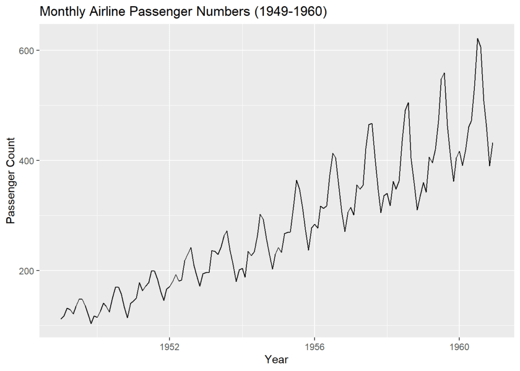
The time series plot provides a visual representation of passenger numbers over time. From this plot, we can observe any underlying trends or seasonality.
Decomposition Plot
# Decomposition plot to identify trend and seasonality
decomp <- decompose(passenger_ts)
plot(decomp)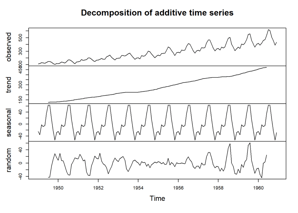
The decomposition plot helps us identify the trend and seasonal components within the data.
This observed component shows the original time series data for each month from January 1949 to December 1960. It represents the passenger counts for each month over this period.
The trend component captures the long-term upward or downward movement in the data. It represents the overall direction in which the passenger counts are heading.
The seasonal component represents the regular, repeating patterns or fluctuations in the data. It’s a matrix that provides seasonal effects for each month. In this decomposition, it indicates how much each month’s passenger count deviates from the long-term average due to seasonal patterns.
The random component represents the irregular or unpredictable fluctuations in the data that cannot be attributed to seasonality or trend. It accounts for noise or randomness in the data. This component can have positive or negative values, indicating deviations from the expected values.
Time Series Modeling
Now that we have explored the data, it’s time to move on to time series modeling. We will use the popular ARIMA (AutoRegressive Integrated Moving Average) model to make predictions.
Model Fitting
The auto.arima() function automatically selects the best ARIMA model based on the data’s characteristics.
# Fit an ARIMA model
model <- auto.arima(passenger_ts)
model
# Series: passenger_ts # ARIMA(2,1,1)(0,1,0)[12] # # Coefficients: # ar1 ar2 ma1 # 0.5960 0.2143 -0.9819 # s.e. 0.0888 0.0880 0.0292 # # sigma^2 = 132.3: log likelihood = -504.92 # AIC=1017.85 AICc=1018.17 BIC=1029.35
The results of the ARIMA model reveal valuable insights. The model is specified as ARIMA(2,1,1)(0,1,0)[12], which indicates that it incorporates two autoregressive terms, one moving average term, and seasonal differencing with a periodicity of 12 months. The estimated coefficients provide information on how past observations influence future passenger numbers. Specifically, the positive values of ar1 (0.5960) and ar2 (0.2143) suggest a positive autocorrelation in the data, indicating that past values have a positive impact on future passenger numbers. The negative ma1 coefficient (-0.9819) implies a strong negative effect of past forecast errors on the current observation. Additionally, the fit statistics show a relatively high variance (sigma^2 = 132.3) in the model’s residuals. The log likelihood is -504.92, indicating a reasonably good fit. However, the AIC (1017.85) and BIC (1029.35) values suggest that there may be room for model improvement or exploration of alternative model specifications.
Forecasting
With our model in place, we can make future predictions. Let’s forecast airline passenger numbers for the next 12 months.
# Forecasting for the next 12 months
forecast_values <- forecast(model, h = 12)
forecast_values
# Point Forecast Lo 80 Hi 80 Lo 95 Hi 95 # Jan 1961 445.6349 430.8903 460.3795 423.0851 468.1847 # Feb 1961 420.3950 403.0907 437.6993 393.9304 446.8596 # Mar 1961 449.1983 429.7726 468.6240 419.4892 478.9074 # Apr 1961 491.8399 471.0270 512.6529 460.0092 523.6707 # May 1961 503.3945 481.5559 525.2330 469.9953 536.7937 # Jun 1961 566.8624 544.2637 589.4612 532.3007 601.4242 # Jul 1961 654.2602 631.0820 677.4383 618.8122 689.7081 # Aug 1961 638.5975 614.9704 662.2246 602.4630 674.7320 # Sep 1961 540.8837 516.9028 564.8647 504.2081 577.5594 # Oct 1961 494.1266 469.8624 518.3909 457.0177 531.2356 # Nov 1961 423.3327 398.8381 447.8273 385.8715 460.7939 # Dec 1961 465.5076 440.8229 490.1923 427.7556 503.2596
The forecast table provides range of predictions for each month, taking into account different levels of confidence. The wider the prediction interval (e.g., 95% interval), the more conservative the prediction, as it accounts for a larger range of potential outcomes. Conversely, the narrower interval (e.g., 80% interval) provides a more specific but less conservative estimate
Visualizing the forecast
Now let’s create a visual representation of our forecasted passenger numbers for the upcoming 12 months, based on the ARIMA model we’ve developed.
# Plot the forecast for the next 12 months
plot(forecast_values,
     main = "Forecast for the Next 12 Months",
     xlab = "Time",
     ylab = "Passenger Count")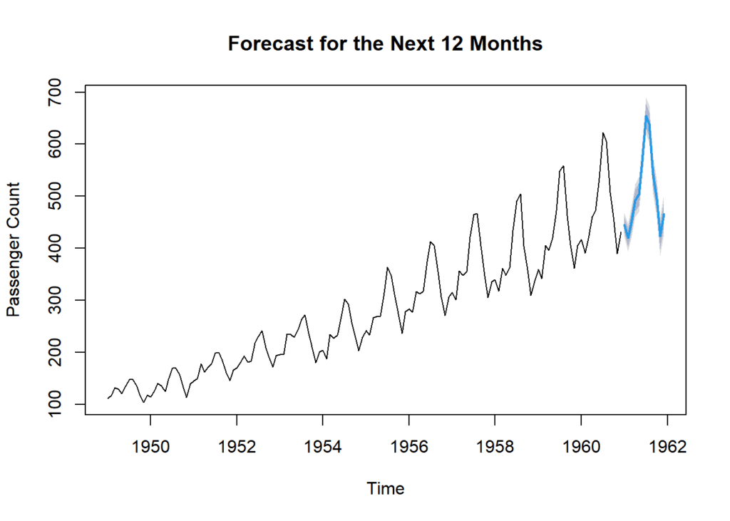
This chart represents a forecast for the next 12 months. We’re not predicting the weather, but something equally fascinating—passenger counts. Here on the x-axis, you can see time. It spans from January 1961 to December 1961. On the y-axis, we have the passenger counts. It’s essentially the estimated number of passengers for each of these upcoming months.Now, this line right here, it represents the model’s point forecasts. In simple terms, it’s showing us what the model predicts the passenger counts will be for each month in 1961. You might also notice these shaded areas around the line. These represent prediction intervals. In other words, they show the range within which the actual passenger counts are likely to fall, based on the model’s predictions.
Conclusion
In this comprehensive guide, we’ve explored the fascinating world of time series analysis using R. We started by understanding the fundamentals, setting up our environment, and preprocessing the data. We then delved into exploratory data analysis, where we visualized the data and identified patterns. Finally, we applied time series modeling techniques to make forecasts.
Time series analysis is a powerful tool that can provide valuable insights for decision-making in various domains. With R’s extensive capabilities and packages, you’re well-equipped to tackle time series data and extract meaningful information.
So, whether you’re analyzing financial trends, predicting stock prices, or forecasting future sales, R is your go-to tool for mastering time series analysis. With the knowledge and skills gained from this guide, you can confidently embark on your own time series analysis projects.
Stay tuned for more data-driven content and happy analyzing! 🤓
Download R program —
Click_hereDownload R studio —
Click_here

